Packaging and Merchandising Design -Final Compilation
Week 1 - Week 14 (25/04/2024 - 25/07/2024)
Lee Jia Rou 0364251
Bachelor
of Design (Hons) in Creative Media
MER 60104/ Packaging and
Merchandising Design
Final Compilation
Directory
Task 1: Exercises
Project 1: Box Making
Project 2: Innovative Packaging (Collaboration project with School of
Biosciences)
Final Project: Merchandise and Promotional Strategy
Task 1: Exercises
Week 1 - Week 4 (25.04.2024 - 16.06.2024)
1) Hi Top Tea (box)
Overview

Highland India is where Enrico sources his Hi Top teas. Just tender leaves
are chosen for these meticulously chosen teas. "Cutting," "turning," and
"curling," among other "CTC" methods, are then used to prepare the tea
leaves.
Product Analysis
This Hi Top tea packaging was the first poorly designed package I selected
because I felt the front page's green pattern made it difficult for me to
read the writing on it and made it difficult for me to tell what product
it was when I first saw the packaging. Additionally, I believe the tea
garden pattern on the green backdrop pattern should have been simplified
by the designer, but it is hard to tell what pattern is on this
package.Even though I was able to identify this was a bag of tea right
away, I didn't instantly recognise what kind of tea it was until I came
across an updated version of the package design that had a better backdrop
image. In order to see additional information, I had to turn to the side
of the box.
Market Research
The package's phrases tell us that there are two languages: Malay and
English. Additionally, the packaging has the hala logo, which indicates
that the target audience for this product is likely to be the Malay
community or the Malaysian market. The patterns, colours, and other
elements of this packaging design, however, are not focused on appealing
to young people's aesthetics. Although I believe that the intended
audience should be a little older, I find it difficult to read the content
on the box because of the small, thick type. Not to mention those elderly
people.
Competitor Analysis
Lipton

Lipton is the first tea brand that springs to me when I come across tea
because of its beautiful packaging. When I buy tea , the colour of the
container draws my attention and also reminds the bright colour of the tea
leaves when brewed. The packing box features a white gradient effect in
the centre to reflect sunlight, and a company logo on the front. Since
this is a British company and most British people start their day with a
cup of tea in the morning, I believe this is an excellent design.
2) soya drinks powder (plastic package)
Overview


The plant bio soy milk produced by BHC Health Sdn Bhd is a source of
natural health foods, organic foods, and dietary supplements. Since its
founding in 2010, BNC has worked to advance the idea of healthy eating by
fusing functional foods with basic nutrition to support natural therapy
and encourage self-health, eventually assisting the public's physical and
emotional well-being.
Product Analysis
This Planet Bio Soy Milk plastic package is the one I went with. The fact
that the soy milk powder is only placed in a foil bag and that the
information is put on a sticker rather than being beautifully designed
leads me to believe that this packaging is pretty straightforward. The
label makes it clear that it is cholesterol-free, has no added sugar, and
is made with a formula that substitutes for milk. You can see that this is
a nutritious beverage produced with soy milk that is high in calcium.
Market Research
The beverages that are appropriate for infants older than one year old,
young adults, and even the elderly are listed at the bottom of the
sticker.
Competitor Analysis
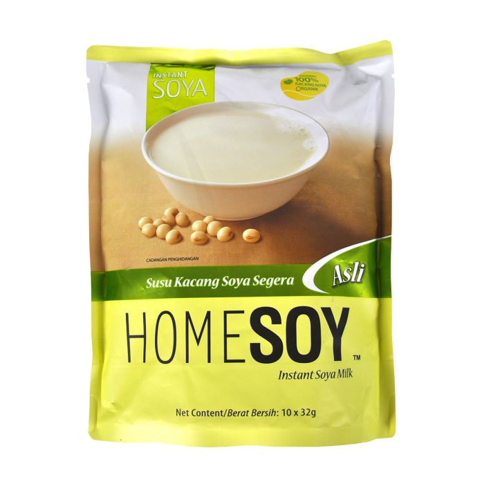
The packaging design of Homesoy makes it evident to customers what kind of
product it is. The product's weight and the fact that organic beans were
used are prominently displayed on the front of the packaging. The
packaging's colour is distinctly soy milk-related. The optimal brewing
method nutritional data for the soy milk component, the manufacturing
location, the barcode, and the best before date are all listed on the
package's back.
3) perfume (glass bottle)

Overview
This perfume is from Che La Verne, a premium quality perfume form Paris at
affordable price with 60+scents choice.
Product Analysis
There is a glass bottle for this scent. Stickers with information are
affixed to the glass bottles. The product's capacity, perfume series, and
brand emblem are shown on the front of the packaging. The packaging has a
product number on the rear side. The product comes mostly in black and
white with gold accents. I believe there is too much information displayed
on the sticker located on the cover. The sticker's content, which contains
the brand name, product series, logo, and product capacity, prevents
viewers from concentrating on the most important details when they view
this package.
Market Research
The target group of the product is to allow consumers to buy different
types of perfumes at reasonable prices.
Competitor Analysis

It's a glass perfume bottle as well. Only unique substance paper is used
to print the brand emblem on the front of Celine's perfume. The bottom of
the box displays all product information, guaranteeing its neatness and
highlighting the product's upscale appearance.
4) toner (plastic bottle)


Overview
This is a face toner by RONAS Co., Ltd. is a popular Korean skincare
brands that manufacture and supply a large selection of skincare products
including vitamin c serum, toner etc.
Product Analysis
Due to the transparency of the toner, this package has an opaque off-white
colour. To view the contents within, enough sunshine must be present.
Product function and brand are listed on the front of the packaging; the
product category name is missing. Verify if it is a toner and go over the
information on the back before making a purchase. Nevertheless, only
translation software may be used to decipher the Korean text on the
reverse.
Market Research
When checking the information content, we can find that the language is
all Korean, and we can judge that it is sold in mainland Korea. The
product has a large capacity, so it can be judged that the people buying
it are people who love to take care of their skin.
Competitor Analysis
.jpg)
In my opinion, The Ordinary has the greatest skin care product package
design when compared to others. This is because the product's transparent
bottle allows you to immediately see the colour and quantity of the
product, as well as if it has degraded over time. Customers can easily
grasp the broad contents of the goods since the brand name is prominently
placed on the front of the packaging, followed by the product name and
functions. The product's raw components are listed on the packaging's
reverse side. The product's text size is too huge. Once the can is opened,
the product's optimal use-by date has reached.
Project 1: Box Making
Week 5 - Week 7 (23.05.2024 - 06.06.2024)

Fig. 2.1 comb sketch

Fig. 2.2 goggle sketch

Fig 2.3 comb box folding

Fig 2.4 comb box folding

Fig 2.5 comb box folding 3

Fig 2.6 comb box folding 4

Fig 2.7 goggle box folding 1

Fig 2.8 goggle box folding 2

Fig 2.9 goggle box folding 3

Fig 2.10 goggle box folding 4
Project 2: Innovative Packaging
(Collaboration project with School of Biosciences)
Week 4 - Week 10 (23.05.2024 - 06.06.2024)
Fig 3.1 Presentation Slides PDF

Fig 3.2 Label JPEG

Fig 3.2 Label size JPEG

Fig 3.3 Packaging Mockup- side

Fig 3.4 Packaging Mockup- back

Fig 3.5 Packaging Mockup- front

Fig 3.6 Polygram
Final Project: Merchandise and Promotional Strategy
Week 10 - Week 15 (06.06.2024 - 01.08.2024)
Final Merchandise Designs

Fig 3.1 Final sticker Mockup , JPEG

Fig 3.2 Final plate Mockup , JPEG

Fig 3.3Final cooler bag Mockup , JPEG

Fig 3.4 Final keychain Mockup , JPEG
Final Promotional Strategy

Fig 3.5 Final Freezer advertisement Mockup , JPEG


Reflection
For me, this class was really illuminating. I'd always wondered how the packaging was made and what procedures the designers took to make their visions a reality before I accepted. My admiration for the many kinds of packaging I come across on a daily basis has grown as a result of this experience, and I am now more conscious of the ingenuity and labour that go into making them.
Observation
My observations and analyses of current packaging served as a major source of inspiration for this class. My understanding of how various designs functioned has greatly benefited from this firsthand investigation. By breaking down different packages, I've made great progress. In a subtle but significant way, I am able to pinpoint the components that contribute to each project's effectiveness and uniqueness. This example demonstrates the significant influence that minute details may have on a packaging design's overall performance.
Findings
This module introduced me almost unlimited things. Both the theoretical material and the hands-on approach of designing patterns and shapes taught me a great deal. My thesis benefited greatly from the knowledge I acquired, which deepened my comprehension of a subject I had long been enthusiastic about. In addition to teaching me the technical aspects of packaging design, this seminar deepened my understanding of the creativity and planning that go into the work. I'm excited about the chance to learn more about a subject that has long piqued my curiosity.


