PUBLISHING DESIGN_TASK 3(B)

18/06/2024-16/07/2024 (Week 09 –Week 13)
Lee Jia Rou (0363293)
GCD
61404 / Publishing Design / Bachelor of Design (Hons) in Creative Media
Task
3 (B) / E-book
✧✧Directory ✧✧
Lectures
Instructions
Final Submission
Feedback
Reflection
Further Reading
✧✧Lectures ✧✧
Lectures 01 - 05 can be found here.
✧✧Instructions✧✧
This task coincides with Brand Corporate Identity: Task 04.
Layout Inspiration
I browsed Pinterest to get ideas for layout and design before I started
creating. I learned more about the general brand guidelines and used it
to identify characteristics that I felt fit the bunny haven brand.


Format + Grid System
For this task, we were given a set of dimensions to be 1366 x 768.In order to give the layout a more organised appearance, I decided to put up a grid system and add some columns.


I explored these grids with other layouts and styles after that.
Refined Layout
In order to better fit the brand's vibe—a cosy, cosy setting that nevertheless appears modern and minimalist—I decided to make some design changes and add more branding patterns after getting advice on the layout design from Ms. Lilian and Mr. Haijjaz. I tried to include a more diverse layout design and irregular pattern and line components because the layout used was too orderly and monotonous.


Fig. 1.1-1.3 Brand Guideline Pinterest Board,
link
I chose one of the layouts that I thought was simple and neat to
study his layout design.


Fig. 1.4-1.6 Brand Guideline Pinterest references
For this task, we were given a set of dimensions to be 1366 x 768.In order to give the layout a more organised appearance, I decided to put up a grid system and add some columns.

Fig. 2.1 Task 3 Guideline and information

Fig. 2.2 Page setup


Fig. 2.3-2.4 Margin & Columns settings
Fig. 2.5 Grid system created
I explored these grids with other layouts and styles after that.
Fig. 2.6 Layout Tryouts week 10-11
Refined Layout
In order to better fit the brand's vibe—a cosy, cosy setting that nevertheless appears modern and minimalist—I decided to make some design changes and add more branding patterns after getting advice on the layout design from Ms. Lilian and Mr. Haijjaz. I tried to include a more diverse layout design and irregular pattern and line components because the layout used was too orderly and monotonous.
I decided to complete the layout before making any changes to the
interactivity after getting feedback in Week 11. The version I modified
and presented to Ms. Lilian in the few hours following up to Mr. Haijjaz
lesson is below.


When I finally felt like I was finished, I exported my second final version to make sure everything was operating as it should. A few issues were identified and resolved.
Final Submission
Fig. 2.7 Layout Tryouts week 11-12
Interactive button and animation
In week 12, I added a navigation menu button which is design in
previous and came from a part of the logo berry shape.

Fig. 2.8 Navigation Next & previous Button
This is the area where each chapter's items from the brand guide is
connected. Initially, I made this red column to hold various button
and non-button contents, but once I added the interactive button, I
figured out how to make it show up when the mouse is moved. When you
click on different flipping methods for layers that sit on text, it
will seem differently.

Fig. 2.9 Navigation chapter Button
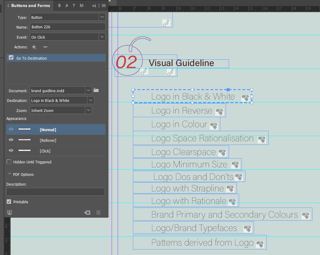
Fig. 2.10 Navigation chapter Button- normal

Fig. 2.11 Navigation chapter Button- rollover

Fig. 2.12 Navigation chapter Button- click
In week 13, I made adjustments to the navigation system banner in
order to better balance the layout from top left to bottom and also
the Navigation Next & previous Button from left to right
and left.
I made adjustments for the navigation system banner to better
balance the presentation of the screen, with a top left to bottom.
For navigation next and previous buttons, mo

Fig. 2.13 Layout Refined-week 12

Fig. 2.14 Layout Refined-week 13
To ensure all navigation worked properly, I chose the bookmark
feature so that I could always go back to the page I wanted to
read while I was reading. Here are all of my bookmarks for this
document; when you pick any of the buttons on the page, the
bookmarks are arranged alphabetically.

Fig. 2.15 Bookmarks
Additionally, I also took note to add button rollover
functionality, picture rendering, colour changes, font content and
title display, and even music to make the PDF more interactive.
Here's a detailed rundown of everything I added.
Colour changes
Fig. 2.16 Interactivity Elements
Text displays
Fig. 2.17 Interactivity Elements
Pattern display
Fig. 2.18 Interactivity Elements
Sound
Fig. 2.19 Interactivity Elements
Finding Images
To enhance the overall look, I source for some image for dessert
buuny themes for my brand guideline from Pinterest.

Fig 3.1 Picture1

Fig 3.2 Picture2

Fig 3.3 Picture3
When I finally felt like I was finished, I exported my second final version to make sure everything was operating as it should. A few issues were identified and resolved.
Fig. 2.14 Layout Tryouts week 13
Thumbnail Layouts


Fig. 3.1-3.4 Final Thumbnails, JPEG
Fig. 3.5 Final Thumbnail, PDF
Final Brand Guideline, PDF Interactive
Fig. 3.6 Final Bunny Haven Brand Guideline, PDF Interactive
Fig. 3.7 Final Bunny Haven Brand Guideline, Online Publishing
✧✧Feedback ✧✧
Week 11
Make sure that your text is place on the grid system and aligned properly throughout the page, add more image in the layout design.
Week 12
-Make the logo bigger instead of the title, make sure the text and box have enough space.
-Make attention to the balance of the layout when adding navigation banner.
Week 13
- write more detail of the brand guideline, but the overall design layout is better now.
✧✧Reflection✧✧
ExperienceThe interaction was really interesting and useful. I had no idea that I could create interactive PDFs using InDesign before, and this is my first attempt at creating an interactive ebook. Therefore, seeing how PDFs can become interactive and have useful buttons is truly fascinating. It was enjoyable to convert a static document into an interactive one and I learnt a new skill that will be useful in future work.
Observations
Observing other people's work is another way that I learn. I believe my peers taught me a lot of new techniques to improve the navigation system, particularly when it came to presenting dynamic navigation buttons with varied colours. It's a fascinating method to do it, and it made me see that I can accomplish this if I'm pleased, which is something I never thought doing for my process.Findings
I gained a lot of insight from this project on how to integrate information from the typography module with knowledge from other assignments to develop powerful brand guidelines that make use of interactive elements. I kept thinking back to earlier tasks, including colour matching, the font grid system I learnt, and how to make the overall design consistent with the brand concept, while working on this task. This helped me to remember what was necessary for producing publications that are suitably designed. I believe that everything that came before was genuinely done step-by-step, and getting to this point was a positive experience.
✧✧Further Reading✧✧
https://www.youtube.com/watch?v=Ygy0-2OrrGY&t=56s


