ADVANCED TYPOGRAPHY - Task 1
Week 1 - Week4
Lee Jia Rou / 0363293
Advanced Typography / Bachelor of Design (Hons) in Creative Media
Task 1-1 Typographic Systems
Task 1-2 Type & Play

✧✧Contents✧✧
~Lecture 1: Introduction Briefing~Lecture 2: AdTypo2 Typographic Composition
~Lecture4:AdTypo_4_Designing Type
~Instructions
~Task 1: Exercises 1 - Typographic Systems
~Task 1: Exercises 2 - Type and Play
~Feedback
~Reflections
~Further Reading
My Vinod guided me about the new learning approach that we would be following this semester. We benefited from lectures and comments from our lecturers throughout the first semester, but now we're going to be more proactive and conduct more self-learning. We will be separated into groups to research and present a topic.
AdTypo_1_Typographic Systems


Task 1: Exercises 1 - Typographic Systems
In this exercise, we will use InDesign to explore eight systems: Axial, Radial, Dilatational, Random, Grid, Modular, Transitional, and Bilateral. Also, we were told to watch the InDesign demonstration videos in the lecture playlist.

Fig 5.4 First draft of Axial System (Week 2: 07/09/2023)

Fig5.5 First draft of Radial System (Week 2: 07/09/2023)

Fig5.6 First draft of Dilatational System (Week 2: 07/09/2023)

Fig5.7 First draft of Random System (Week 2: 07/09/2023)

Fig5.8 First draft of Grid System (Week 2: 07/09/2023)

Fig 5.9 First draft of Transitional System (Week 2: 07/09/2023)

Fig5.10 First draft of Modular System (Week 2: 07/09/2023)

Fig5.11 First draft of Bilateral System (Week 2: 07/09/2023)
FINAL Typographic Systems


Fig 5.13 Final Radial System - Jpeg (Week 2 :09/09/2023)

Fig 5.14 Final Dilatational System - Jpeg (Week 2 :09/09/2023)

Fig5.15 Final Random System - Jpeg (Week 2 :09/09/2023)

Fig5.16 Final Grid System - Jpeg (Week 2 :09/09/2023)

Fig5.17 Final Transitional System - Jpeg (Week 2 :09/09/2023)


Fig5.20 Final Task 1 - Exercise 1: Typographic Systems - PDF (Week 2: 09/09/2023)


After design the type , I combine the letterforms with a visual . The
purpose is to enhance/support the interplay between letterforms and
selected visuals. The text must be intertwined with the image in a
symbiotic relationship.
Observations
Findings
 The second website is called Kreatif Beats, Mr. Vinod recommended us to
read the article.
The second website is called Kreatif Beats, Mr. Vinod recommended us to
read the article.
In this article, Mr Vinod explain the guideline of the exercises and the example of the task.
~Instructions
~Task 1: Exercises 1 - Typographic Systems
~Task 1: Exercises 2 - Type and Play
~Feedback
~Reflections
~Further Reading
✧✧Lectures ✧✧
Week 1 / Introduction & BriefingMy Vinod guided me about the new learning approach that we would be following this semester. We benefited from lectures and comments from our lecturers throughout the first semester, but now we're going to be more proactive and conduct more self-learning. We will be separated into groups to research and present a topic.
AdTypo_1_Typographic Systems
"All design is based on a structural system".(Elam, 2007)
As Typographic systems follow what architects refer to as the
shape grammar. Similar
to typographic systems, these systems have their own set of rule and
provide a feeling of direction that helps focus and make
decisions.
Shape grammar is a set of shape rules that apply in a
step-by-step way to generate a set, or language, of designs.
These are 8 major variations of typographic systems:
Axial, Radial, dilatational, Random, Grid, Modular, Transitional, Bilateral.
Axial, Radial, dilatational, Random, Grid, Modular, Transitional, Bilateral.
- Axial-All elements are organized to the left or right of a single axis (line).
-
can be use multiple or single axes but in task 1 we just use
single axis


Fig 1.1 Axial System
- Radial- Elements are extended from a focal point of focus.
- words will be spread out.
Fig 1.2 Radial System
- Dilatational- Circles dilate or expand from a central point.
- Placed hierarchically
Fig 1.3 Dilatational System


Week 2 AdTypo_2_Typographic Composition- Random System- Elements appear to have no specific pattern or relationship.
Fig 1.4 Random System
- Grid System-A system of vertical and horizontal divisions.
Fig 1.5 Grid System
- Transitional System: An informal system of layered banding.
- look like the cross section earth–with layers of sediment and stone
Fig 1.6 Transitional System
- Modular System: A series of non-objective elements that are constructed as a standardized unit.
- Modular layouts use repeating structures to break up the content
Fig 1.7 Modular System
- Bilateral System: All text is arranged symmetrically on a single axis.
Fig 1.8 Bilateral System
- Principles of Design Composition
- composition-dominant principles underpinning design composition, which are emphasis, isolation, repetition, symmetry and asymmetry, alignment, perspective to name a few.
- However these seem more relevant to imagery than complex units of information that consist different elements.
- The ideas and the application of these ideas into real-life content (images, textual information and colour) on a page or screen can sometimes feel disparate. That said, Some of these principles are a little more easily translatable than the others.
Fig 2.1, Principles of Design Composition
- The Rule of Thirds
- A photographic guide to composition
- It basically suggest that a frame (space) can be divided into 3 columns and 3 rows
- The intersecting lines are used as guide to place the points of interest, within the given space.
Fig 2.2 The Rule of Third
- Typographic Systems
- The Grid System (or Raster Systeme), which is drawn from the grided compositional structure of Letter Press printing, is the most pragmatic and widely utilised of the eight systems。
- It was further refined by what is now known as the Swiss (Modernist) Typography, whose main proponents are Josef Muller Brockmann, Jan Tschichold, Max Bill, and others.
Fig 2.3, Examples of exciting grid structures
- In response to the modernist era's fairly structured approach to typography, a number of younger designers began to question and challenge this sense of order
- Thus, the post-modernist age in typographic systems began, with the exploration of chaos, randomness, and asymmetry.
- Legibility and readability were consigned to the back seat, although the greatest examples appear to mix the two flawlessly. Proponents include, to mention a few, David Carson, Paula Scher, and Jonathan Barnbrook.
- Order was replaced with apparent chaos but this chaos was exciting and 'new for a generation that was being exposed to Punk anti-establishment thought and music. As such the asymmetry, random, repetition, dilatational and radial systems began to take root in the lexicon of designer.
- Other models / Systems
- (Environmental Grid)
- based on an analysis of an existing structure or several structures together. A collection of critical lines, both curved and straight, is produced.
- The designer then organizes his information around this superstructure, which includes non-objective aspects, to produce a one-of-a-kind and intriguing combination of texture and visual stimulus.
Fig 2.4 Environmental Grid
- Form and Movement
- This system encourages students to explore existing grid systems to discover the numerous creative possibilities they offer.
- Its goal is to break out from the rigid notion of grid applications and consider the layout of pictures, text, and colour on book pages to be an intentional type of motion. Forms placed on pages, regardless of media (paper or computer), provide a sensation of movement across the information.
Fig 2.5 Form and Movement
Week 3 AdTypo_3_Context & Creativity
- Handwriting
- The initial basis for shape, spacing, and mechanical type norms was handwriting.
- Hand-drawn letterforms were fashioned by a variety of instruments, including bones, charcoal, plants, brushes, feathers, and steel pens, each of which contributed to their particular appearance.
Fig3.1 Evolution of Latin Alphabet
- Cuneiform [3000 B.C.E]:
- The earliest system of actual writing, used in several languages between 34C. B.C.E through the 1st century C.E.
- Distinctive wedge form was the result of pressing the end of a reed stylus into wet clay tablets. Read from Right => Left.
Fig 3.2 Cuneiform c. 3000 B.C.E
- Hieroglyphics [2613 - 2160 B.C.E.]:
- Egyptian writing system fused with the art of relief carving.
- The initial connection to a future alphabetic system is a combination of rebus and phonetic symbols.
Fig 3.3 Hieroglyphs
3 different ways the hieroglyphic images were used:- Ideograms, represent the things they actually depict.
- Determinatives to show that the signs preceding are meant as phonograms and to indicate the general idea of the word.
- As phonograms to represent sounds that "spell out" individual words.
- Early Greek / 5th C. B.C.E.
- The Phoenicians created a 22-letter phonetic alphabet based on the Egyptian logo-consonantal system.
- The early Greek letters were handwritten without compasses or rules, and they lacked serifs. Over time, the letters became thicker, the openings got smaller, and serifs were added.
- These new forms were used as models for formal lettering in the Roman Empire.
Fig 3.4 Early Greek
- Roman Uncials
- By the 4th century Roman letters were becoming more rounded, the curved form allowed for less strokes and could be written faster lowed for less strokes and could be written faster.
Fig 3.5 Roman Uncials
- English Half Uncials, 8th C.
- Uncial script in England transformed into a slanted and condensed style.
- Meanwhile, in Europe, writing deteriorated and required reform, which came with the Carolingian Handwriting Reform.
Fig 3.6 English Half Uncials, 8th C
- Emperor Charlemagne 8 C. CE
- After the fall of the Roman Empire, the end of advanced central culture led to widespread illiteracy and the differentiation of writing styles, forming different regional styles.
- For 300 years, written knowledge survived mainly in remote religious monasteries and ashrams.
Fig 3.7 Emperor Charlemagne
- Carolingian Minuscule
- Under Charlemagne's patronage, book production increased, and language standards were established, including pronunciation, spelling, and writing conventions like capitalization, spacing between words, and punctuation.
- Introduced for legal and literary works to promote communication across the expanding European empire.
- This script later influenced Humanistic writing in the fifteenth century, which, in turn, served as the basis for our lowercase Roman type.
Fig 3.8 Carolingian Minuscule
- Black Letter (12-15 C. CE)
- Gothic was the culminating artistic expression of the middle ages, occurring roughly from 1200—1500.
- The term Gothic originated with the Italians who used it to refer to rude or barbaric cultures north of the Italian Alps
- Distinguished by its close letter spacing and compact letterforms, this style prominently featured uniformly spaced vertical elements. The practice of compressing line spacing and letter spacing served to decrease the consumption of expensive materials during book production.
Fig 3.9 Black Letter
- The Italian Renaissance
- When the Gothic spirit reached its peak in different parts of Western Europe, the slow revival of the culture of antiquity was by the Humanist scholars in Italy.
- Embraced the ancient Greek and Roman culture, which resulted in creating art, architecture, literature and letter form design. Named the newly rediscovered letterforms Antica.
Fig 3.10 Antica Font
- Movable Type [11 C. - 14 C.]
- Printing (wood block) had already been practiced in China, Korea and Japan (Dharani Sutra, AD 750).
- Earliest known printed book (AD 868) is the Diamond Sutra: 16’ scroll with the world’s first printed illustration.
- introduction of moveable type was introduced in the 1000-1100 CE. This innovation was pioneered in China but achieved in Korea (Diamond Sutra). In the late 1300-1399 CE, several decades before the earliest printing in Europe
Fig 3.11, Movable Type
- Evolution of Middle Eastern Alphabets
- the Phoenician letter marks a turning point in written language—use of sound represented in letters—the script itself has been possibly influenced by the Egyptian Hieroglyphics and Hieratic Scripts.
Fig 3.12, Evolution of Middle Eastern Alphabets
- The Evolution of the Chinese script
- From the Oracle bone to Seal Script to Clerical Script, Traditional and Simplified scripts.
Fig 3.13, Evolution of Chinese Scripts
- Indus Valley Civilization(IVC) Script [3500 - 2000 BCE]
- The oldest writing found in the 'Indian' subcontinent.
Fig 3.14, Indus Valley Civilization(IVC) Scrip
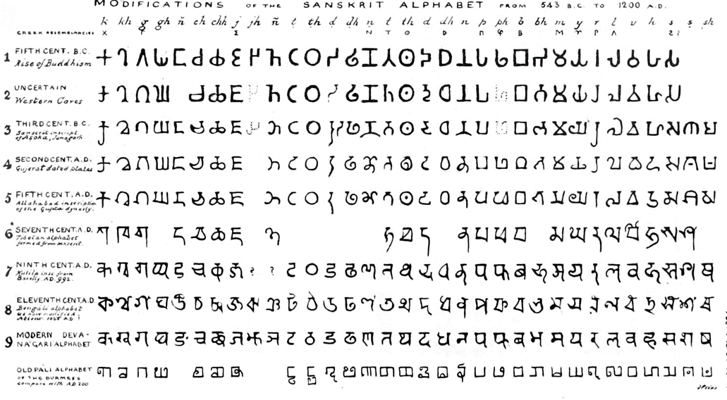
- The Brahmi script (450–350 BCE)
- the earliest writing system developed in India after the Indus script.
- one of the most influential writing systems; all modern Indian scripts and several hundred scripts found in Southeast and East Asia are derived from Brahmi
Fig 3.15, Brahmi Script
Week 4 AdTypo_4_Designing Typetype design carries a social responsibility so one must continue to improve its legibility.
type design is a form of artistic expression.
- General Process of Type Design:
1. Research
Typeface design involves understanding type basics, purpose, and potential applications, along with exploring existing fonts for inspiration and context.
2. Sketching
Typeface designers use two primary methods for sketching: traditional tools like brushes, pens, and paper, which are then digitized, or digital tools like Wacom tablets directly in font design software. Each method has its advantages and disadvantages.
3. Digitization
Professionals use specialized software like FontLab and Glyphs App for digitizing typefaces. Some designers prefer Adobe Illustrator but it's not favored by purists. During this process, focus is not only on the whole form but also on the counter form, which significantly impacts readability.
4.Testing
Testing is a vital part of the design thinking process for typefaces, aiding in refining and correcting various aspects. Prototyping also contributes valuable feedback. The importance of readability and legibility varies depending on the typeface category, with display types prioritizing form expression over strict readability.
5. Deploy
Even after deploying a typeface, unforeseen issues may arise that were not discovered during prototyping and testing. Therefore, the revision process continues post deployment, emphasizing the importance of thorough testing to minimize potential problems.
- Typeface Construction
- Roman Capital: The grid consists of a square, and inside it a circle that just touches the lines of the square in four places. Within the square, there is also a rectangle.
Fig 4.1 Construction grid for Roman Capital
- Construction and considerations:
- Classification according to form and construction
- Depending on their form and construction, the 26 characters of the alphabet can be arranged into groups
Fig 4.2 Capital and a group of lowercase letters
- The consideration when creating a typeface cannot be covered in its entirety in a single lecture or in a couple of slides. As such I would urge you to read more about it, when time permits or when the need arises here.
Fig 4.3 The letter c & e
✧✧Instructions✧✧
Task 1: Exercises 1 - Typographic Systems
In this exercise, we will use InDesign to explore eight systems: Axial, Radial, Dilatational, Random, Grid, Modular, Transitional, and Bilateral. Also, we were told to watch the InDesign demonstration videos in the lecture playlist.
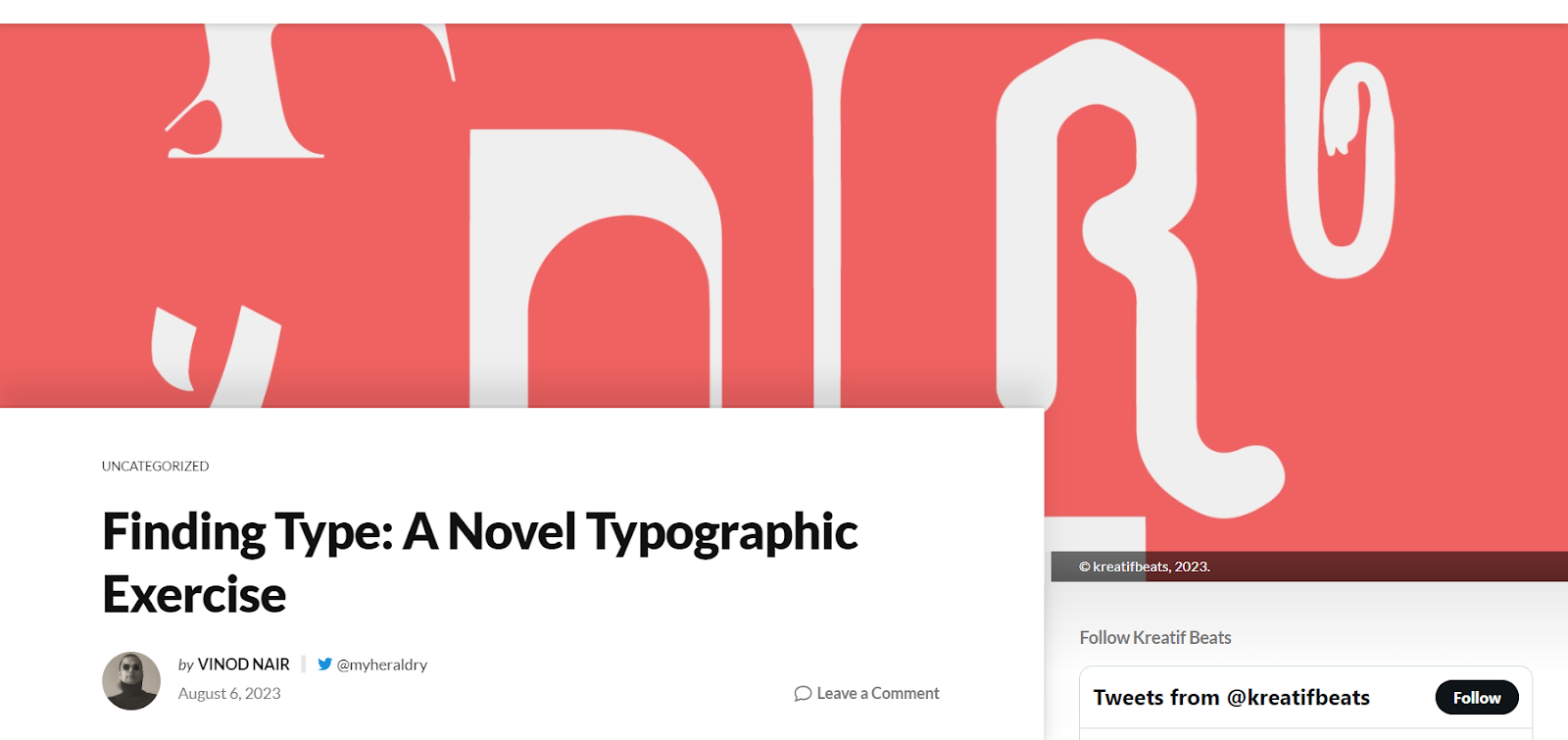
I also continued browsing a website called 7 Essential Typography
Layout Systems to find more examples of systems to deepen my
understanding.
We are required use the following content:
The Design School,
Taylor’s University
All Ripped Up: Punk Influences on Design
or
The ABCs of Bauhaus Design Theory
or
Russian Constructivism and Graphic Design
Open Public Lectures:
June 24, 2021
Lew Pik Svonn, 9AM-10AM
Ezrena Mohd., 10AM-11AM
Suzy Sulaiman, 11AM-12PM
June 25, 2021
Lim Whay Yin, 9AM-10AM
Fahmi Reza, 10AM-11AM
Manish Acharia, 11AM-12PM
Lecture Theatre 12
Progress---
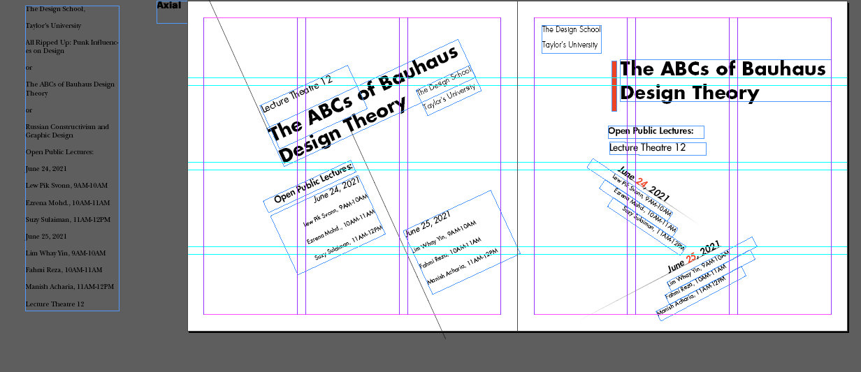
 Fig 5.2 First progress of Raid System (Week 2:
05/09/2023)
Fig 5.2 First progress of Raid System (Week 2:
05/09/2023)
 Fig 5.3 First progress of random System (Week 2:
05/09/2023)
Fig 5.3 First progress of random System (Week 2:
05/09/2023)
Fig 5.1 First progress of Axial System (Week 2:
05/09/2023)

Fig 5.4 First draft of Axial System (Week 2: 07/09/2023)

Fig5.5 First draft of Radial System (Week 2: 07/09/2023)

Fig5.6 First draft of Dilatational System (Week 2: 07/09/2023)

Fig5.7 First draft of Random System (Week 2: 07/09/2023)

Fig5.8 First draft of Grid System (Week 2: 07/09/2023)

Fig 5.9 First draft of Transitional System (Week 2: 07/09/2023)

Fig5.10 First draft of Modular System (Week 2: 07/09/2023)

Fig5.11 First draft of Bilateral System (Week 2: 07/09/2023)

Fig5.12 Final Axial System - Jpeg (Week 2 :09/09/2023)

Fig 5.13 Final Radial System - Jpeg (Week 2 :09/09/2023)

Fig 5.14 Final Dilatational System - Jpeg (Week 2 :09/09/2023)

Fig5.15 Final Random System - Jpeg (Week 2 :09/09/2023)

Fig5.16 Final Grid System - Jpeg (Week 2 :09/09/2023)
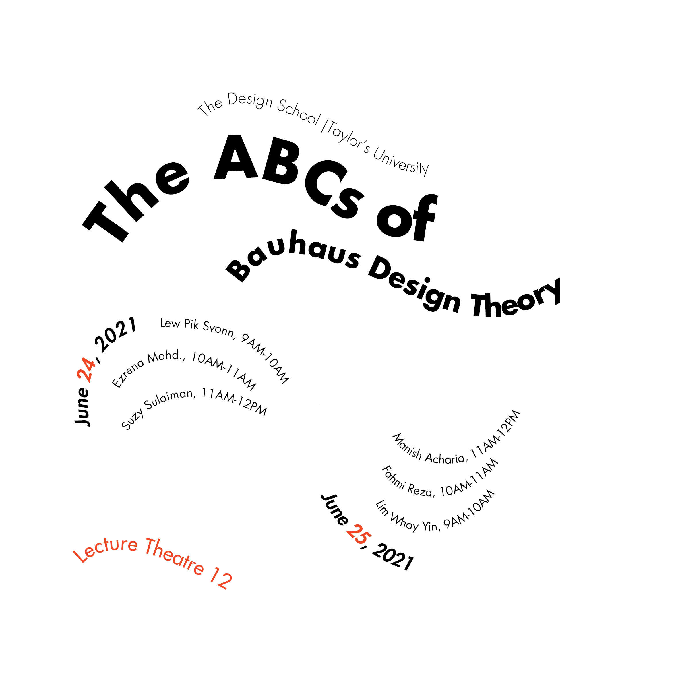
Fig5.17 Final Transitional System - Jpeg (Week 2 :09/09/2023)

Fig5.18 Final Modular System - Jpeg (Week 2 :09/09/2023)

Fig 5.19 Final Bilateral System - Jpeg (Week 2 :09/09/2023)
Fig5.20 Final Task 1 - Exercise 1: Typographic Systems - PDF (Week 2: 09/09/2023)
Fig 5.21 Final Task 1 - Exercise 1: Typographic Systems - PDF guide
line(Week 2: 09/09/2023)
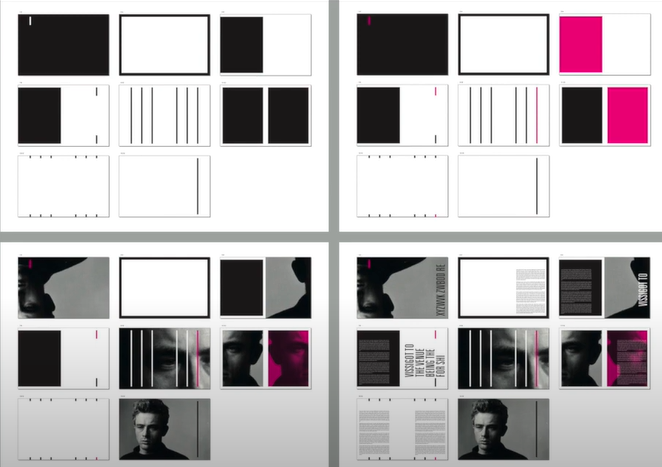
Task 1: Exercises 2 - Type and Play
In this task we will be asked to select an image of a man-made
object or structures , or something from nature and the image does
not contain many different elements.
We will analyze, dissect, and identify underlying letter forms in
profiling images explored in digitized. These process forms
will transform from crude representations to more refined
celebrations that reflect, in part, their origins.
Fig6.1 Identification of letters, 10/9/2023
Fig6.2 References font, 11/09/2023
Fig6.3 Progress of digitalization,12/09/2023
Fig6.4 Progress2 of digitalization,12/09/2023
Final

Fig6.5 Compiled Process, 13/09/2023

Fig6.6 Letter v , 13/09/2023

Fig6.7 Letter e , 13/09/2023

Fig6.8 Letter a , 13/09/2023

Fig6.9 Letter n , 13/09/2023

Fig6.10 Letter k , 13/09/2023
Fig6.11 Final Finding Type - PDF ,13/09/2023
My first idea was to incorporate the font into a mysterious movie
poster. I only have a background photo of one person, using white
fonts. I add some transparent white lines after the white fonts to
highlight the fonts. Using the lighting in the background image, the
viewer can extend from the background person to the fonts.


Fig6.12 Frist version Original photo,19/09/2023

Fig6.13 Frist version Type and Image,19/09/2023
However, Mr Vinod emphasized that the background image just
expresses the feeling of the font, and the main role is the font, so
I thought that my first idea was not to see the font itself at a
glance, so I found a second background image.

Fig6.14 second version Original photo,20/09/2023
Fig6.15 Final version Type and Image Jpg,20/09/2023
Fig6.16 Final version Type and Image PDF,20/09/2023
✧✧Feedback ✧✧
Week 2
General Feedback: Overall is good but need to
improve more on the spacing.
Specific Feedback: Random system not enough contrast, lack
of random style. Grid system word spacing to width. Radial system content
can be rotate down more to balance the white space in the
artboard.
Week 3
General Feedback: The sample word font must be similar to the item to develop the
word. All word must be capital letter or upper letter.
✧✧Reflections ✧✧
Experience
The first task was not as difficult as I thought it would be since,
despite the time limitations we faced, I was able to finish almost all
of the work on time. When it comes to finishing this work, I didn't
have the greatest time management skills. One thing I want to take
away is that I was able to judge my work even without Vinod sir's help
which was a huge advantage especially when we couldn't ask him
questions outside of class. That's a good thing, since I've now gained
some typographic abilities that allow me to see mistakes in my own
work and come up with fixes on my own, and I'm also interested in
exercising.
Observations
While focusing on these tasks, I was able to complete the required
study, which helped me keep on track and focused on what I wanted to
achieve. During Mr. Vinod's feedback I also looked at several of my
classmates' designs and was motivated by them to improve my own. I
made my poster seem much better than the previous version with help of
friends and by making the provided work, making it feel more thought
out rather than beautiful.
Findings
Before starting exercise one, I had a stereotype about printing
systems. In my opinion, they are limiting and lack creative thinking.
However, when I tried different layouts, my perspective changed. It
was very interesting and gave me new knowledge.
 This is a good website to study because even with the lectures given by
Vinod sir, the typographic system is not very clear to me. It's
especially helpful with transitional and grid systems because when I
come across these two typographic systems it feel similar for me.
This is a good website to study because even with the lectures given by
Vinod sir, the typographic system is not very clear to me. It's
especially helpful with transitional and grid systems because when I
come across these two typographic systems it feel similar for me.
This website also teach me more than typographic systems like how to adjust the column width to improve my design skill.
✧✧Further Reading✧✧
This website also teach me more than typographic systems like how to adjust the column width to improve my design skill.
In this article, Mr Vinod explain the guideline of the exercises and the example of the task.
I learn the step of how to start the task:
Finding an image.
Deconstructing an image.
Identifying letterforms.
Extracting letterforms.
Identify a reference.
Refining letterforms.
Introduce consistency in height, width and contrast.
Deliberate on retaining or removing characteristics.
Decide what areas require simplification.


