Typography -TASK3

26/05/23 - 26/06/23
WEEK 8 - WEEK 13
Lee Jia Rou (0363293)
Typography GCD 60104
Bachelor of Design (Hons) in Creative Media
Task 3 / Type Design & Communication
✧✧Contents✧✧
~Research~
~Exploration~
~Digital exploration~
~Developing the final font in FontLab ~
~Poster Design~
~Final Outcome~
~Feedback~
~Reflections~
~Further Reading~
✧✧Lectures ✧✧
Lectures can be referred in
Task 1.
✧✧Instructions ✧✧
<iframe
src="https://drive.google.com/file/d/1XvxKmzL9eICqy_qP3nkTuDsWdXPm9k_V/preview"
width="640" height="480" allow="autoplay"></iframe>
Task 3 / Type Design & Communication
In task 3, we are require to prepare 5 different writing tools including one or two non-traditional tool and few graph paper. We experimented by creating diagonal, horizontal, vertical, and circular lines in 5 different ways for each tool, writing AOTMX in 5 different ways for each tool, selecting 1 choice from 5 different possibilities for each tool, and writing "a et k gr i y m p n" in the selected style. we are require to write, choose uppercase or lowercase letters.
Strokes vary mostly due to the type of nib used, but they can also change due to how the pen is handled, the positioning of the paper, and the pressure used when writing.

Figure 1.1Require word and experiment lines
1. Research on type design

Figure 2.1 typographic rules
As stated in the brief, our typography must follow typographic rules
such as baseline, median, ascenders, and descenders, as well as the
typographic fundamentals shown in Figure 2.1 above. When producing the
drawing, we should keep these in mind.


Figure 2.2 Figure 2.3
Ms. Vinod mentioned an Instagram page called grillitype when it came to
punctuation. It discusses how different punctuation symbols connect to one
another, such as how periods should be long enough to signify a stop in the
text while not interfering with the flow of reading.
2. Exploration
The tools I have use are:
The tools I have use are:
• ZIG brushable
• ZIG calligraphy(5.0mm)
• cotton stick
• Ice-cream stick
• ZIG kurecolor (fine)

Figure 3.1 Selected tools(19.05.23)
To begin, I utilise five different tools and write with five different strokes. This allows me to understand how to make various shapes of strokes.

Figure 3.2 Practice of 5 different tools ,ZIG brushable and ZIG calligraphy(19.05.23)

Figure 3.3 Practice of 5 different tools,ZIG calligraphy and ZIG kurecolor (19.05.23)

Figure 3.4 Practice of 5 different tools, cotton stick and Ice-cream stick (19.05.23)
In the week 8 assessment, I didn't notice the font size and letter base criteria for leading lines. So I just reworked the exercises based on my own handwriting. When improving the font, I chose lowercase to better match my font and font.

Figure 3.5 Practice and refinement of selected handwritings (19.05.23)
Next is compiling the handwriting on a piece of graph paper with different tools.

Figure 3.5 Compilation of 5 different handwritings by each tool (19.05.23)
Based on the 5 different writing tools used, I have chosen the type written using the ZIG brush tools as I like the curvature of the strokes on the turns. I further practiced and refined the letters to have a consistent stroke and height and size that complemented each letter nicely.

Figure 3.5 further practiced and refined (30.05.23)
3. Digital exploration
Mr. Vinod's example video was used to construct these guidelines, which used the letters "Tyd" in the Myriad Pro Regular typeface.
Ascender line:725pt

Figure 4.2: Guidelines.(02.06.23)

Figure 4.3: developing on "e" word.(09.06.23)

Figure 4.4: developing (09.06.23)

Figure 4.4: developing, outline (09.06.23)Base on the Instagram page grillitype , I came out with this punctuation and comma

Figure 4.4: Creating punctuation and comma.(02.06.23) Figure 4.5: Construction progress of punctuation marks.(09.06.23)
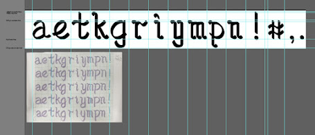
Figure 4.5: Digitalized letterforms and punctuations.(13.06.23)
Mr. Vinod's example video was used to construct these guidelines, which used the letters "Tyd" in the Myriad Pro Regular typeface.
Ascender line:725pt
Cap line: 700pt
Median line: 500pt
Baseline: 0pt
Descender: -225pt

Figure 4.2: Guidelines.(02.06.23)
After creating the guides, I started digitizing the drawn letters in Adobe Illustrator.
Figure 4.3: developing on "e" word.(09.06.23)
Figure 4.4: developing (09.06.23)
Figure 4.4: developing, outline (09.06.23)
Figure 4.4: Creating punctuation and comma.(02.06.23)
Figure 4.5: Digitalized letterforms and punctuations.(13.06.23)
4. Developing the final font in FontLab
During the digitization process, I made sure that all the fonts were consistent and beautiful, and I followed the tutorial provided by Mr. Vinod to export them to FontLab.


Figure 5.2: Kerning between letterforms(13.06.23)

Figure 5.3: Kerning between letterforms and punctuation (13.06.23)

Figure 5.4: try out the word in poster(13.06.23)
5.Poster Design
The next step in the task is to construct a basic poster using the typefaces you produced. The following are the poster requirements:
• Poster size must be A4 size.
• The words must contain all letter forms created.
• Words must have the same point size.
• Posters must communicate the impact of the promoted typeface.
First, I start by typing in some random word combinations to get inspiration for writing sentences.

Fig 6.1 Drafting of Phrases (20.06.23)

Fig 6.2 Different layouts of poster composition. (20.06.23)

Fig 6.3 Final poster. (20.06.23)
6. Final Outcome
Font download link
https://drive.google.com/file/d/1u_NQjUNCkDmJNx-BEOR6ST5xzHuoNcE3/view?usp=sharing

Figure 7.2: Final Task 3: Type Design and Communication "Brush CLJR" -PDF.
( 26.06.2023)

Figure 7.3: Final poster "Brush CLJR" -JPG.
(26.06.2023)
Figure 7.3: Final poster"Brush CLJR" -PDF.
(26.06.2023)
✧✧Feedback✧✧
Week 8
General Feedback: This week we start working on task 3. In
this task we need to select 5 different tools, there are commonly used
pens and our experimental tool (not traditionally used for writing). For
each selected tool, 5 different scripts were generated, and for each tool,
the best of the 5 was selected for practice and generated as a font. Since
this was an ILW, the general feedback I got was from comments to my peers
on the FB page. The baseline placement of letters is a typical mistake
that everyone makes. Everybody commits the mistake of placing letters
incorrectly on the baseline. He requested that we check the problem to
ensure that the letters were properly positioned on the baseline. The goal
of the exercise is to learn the greatest digitizing. Consequently, the
chosen design shouldn't be the same for all 5 tools.
Week 9
Week 9
General Feedback: Mr. Vinod provided feedback on our final
options for digitizing and creating typefaces from our writing practice.
He suggests that we focus on practicing with the chosen handwriting and
select the most suitable one for the digitization process. Any necessary
adjustments should only be made during the digitization phase to enhance
the font's character. He advised us to practice with the chosen
handwriting and pick the one that would work best for the digitizing
procedure. To better understand what makes a high-quality typeface, it
is advised to make use of existing typefaces and thoroughly examine
their structural details throughout the digitization process. Each
letter needs to be consistent, so make sure they all have the same
vertical stroke, for instance.
Specific Feedback: I chose the type written with a
calligraphy pen that was evaluated in class. Mr. Vinod gave practical
examples for some letters to improve my current practice. For example,
the horizontal line under the letter "g" should touch the x-height.
Week 10
General Feedback: Digital type has the control and consistency
to define vertical and horizontal strokes, but handwritten letters
have lines that are all different lengths and angles since they are
produced by hand. Consistency is a must when producing digital
typefaces. It is quite beneficial to better understand how typefaces
are not always what they appear to be, although they sometimes look
like one another, they often do not.
Specific Feedback: Mr. Vinod showed me how to rapidly
illustrate the typeface I created and how to modify it to fit my
desired form. I wanted to make brushes that are useful to me since my
fonts differ from square ones in that they have unique angles and
stroke forms. He also advised me to keep trying new things.
Week 11
General Feedback: This week, we were requested to elaborates on the entire blog, including all relevant sections, as well as the matching submissions specified in the assignment rules and regulations. Aside from that, punctuation should be consistent with your font style; for example, the exclamation point's stroke should be the same width as the typeface's vertical stroke. Overshoot should always be present in rounded strokes.
Specific Feedback: My typeface is better suited for use with the brush tool. Mr Vinod showed us how to change the brush tool's settings to make the stroke direction more similar to my original typeface.
Week 12
General Feedback: Mr. Vinod examined our poster composition this week after examining our typeface. He noted that the poster's composition should be energetic and striking, but also have tension and balance. It is critical to use dynamics and impact to capture your audience's attention. He also reminded us to pay attention to the homework requirements, and the font size of the poster must be the same.
Specific Feedback: After typing out my font in poster design, I discovered that the letter spacing is off, so I returned to Fontlab and redone the kerning.
✧✧Reflections ✧✧
ExperienceDuring assignment 3, I learned a lot of new ideas, such as how to use new apps like and how to explore traditional word to adobe illustration and develop in Fontlab. This work provided several problems, and it was fascinating to see the final product in Fontlab.
This is the most enjoyable duty since we develop a typeface from beginning to end, including research and exporting a downloadable font. I was joyful to see my written word digitized and ready to type, so all of the effort was worthwhile since the results were amazing. This task has provided me with invaluable experience, for which I am thankful.
Observations
Before beginning the idea phase, I widely study the basic concepts of type design and analyze current fonts in order to gain a better understanding of how individual letters are created. During the project's research phase, a remarkable finding was made: certain letter forms, although having significant symmetry even when zoomed in closely, only disclose their symmetry when the designer makes alterations. Asymmetrical in nature.
Findings
The process of creating typefaces has given me a higher understanding of typography as a comprehensive discipline. I learned the specific rules of punctuation design. Although each punctuation mark follows its own set of guidelines, their stroke characteristics are correlated with those of the letterforms, making this task more challenging than designing the letterforms themselves.
✧✧Further Reading✧✧

I read portions of Mr. Vinod's book "Typography: Form and Communication" every week because he highly suggested it and also many grid is important on typography.
Proportions of the letterform
Proportions of the letterform

Stroke-to-height ratio.The ratio between stroke and height is a crucial consideration in type design. In the case of the Roman letterform shown above , it exhibits the stroke-width-to-capital-height proportion commonly found in Roman inscriptions. When superimposed on a grid, it becomes evident that the letter's height is ten times the stroke width. By examining the adjacent rectangles, we observe the impact of altering the stroke width. The letter in the center is reduced to half the normal stroke width, resulting in a noticeable change in weight and appearance. Conversely, the letter on the right has its stroke width expanded to twice the normal width, further emphasizing the distinct alteration in the letterform's weight and overall visual representation.
x-height and proportion.The proportional relationship between the x-height and the heights of capital letters, ascenders, and descenders plays a vital role in shaping the visual characteristics of typography. This relationship exerts a significant influence on the optical qualities and overall aesthetic impact of the typography.

Pointed and curved letters tend to have less visual weight at the top and/or bottom guidelines, which can create an illusion of them being shorter than letters that end squarely with those guidelines. To maintain a consistent perceived height with the other letters, the apexes of pointed letters extend beyond the baseline and capline. Similarly, curved letterforms are drawn slightly above and below these lines to ensure they do not appear disproportionately small.


