Typography -Task2

01/05/23 - 26/05/23
WEEK 5 - WEEK 8
Lee Jia Rou (0363293)
Typography GCD 60104
Bachelor of Design (Hons) in Creative
Media
Task 2 / Typographic Exploration & Communication
(Text Formatting and Expression)
✧✧Contents✧✧
✧✧Lectures ✧✧
Lectures can be referred in Task 1.
✧✧Instructions ✧✧
<iframe
src="https://drive.google.com/file/d/1ZUFpqvArUaQRKtEiut_86gqAtlhs9fBe/preview"
width="640" height="480" allow="autoplay"></iframe>
Task 2 / Typographic Exploration & Communication (Text Formatting
and Expression)
In this task, we will be requested to convey the text typographically in a two-page editorial spread (200mm x 200mm each page). Choose one of the three text options available. Images are not
permitted. However, some modest graphical features, such as lines, shades,
and so on, may be permitted.
Requirements
• 1 from the 3 text options provided• 2-page editorial spread of 200mm x 200mm per page
• Only in greyscale.
• Only using 10 typefaces
• Only minor graphical elements are allowed, such as line, shade.
Research
Before beginning work on the task at hand, I looked at several visual
references of editorial extends for inspiration, hoping that it could help
me in creating my ideas.
Fig 1.1 Visual References (03/05/2023)
I learn the meaning of the text after looking for references and chose "A
code to build on and live by" to my design. Before creating my design, I
searched for for the original text selections, which I felt would
help me express the words that more correctly.
https://deardesignstudent.com/a-designers-code-of-ethics-f4a88aca9e95
Fig 1.2 A Designer's Code of Ethics
Initial Process
Ideation
Fig 2.1Ideation 1 (03/05/2023)
Layout
I tried these three different layouts before deciding on the final
outcome. I believe that the design I present is basic and easy to
understand.
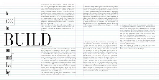
FINAL Editorial Spread
HEAD
Font/s: Bodoni Std(book)
Type Size/s: 48 pt
Leading: 13 pt
Paragraph spacing: 13 pt
BODY
Font/s: ITC Garamond Std (book)
Type Size/s: 10 pt
Leading: 12 pt
Paragraph spacing: 12 pt
Characters per-line: 52- 62
Alignment: Justify with last line aligned left
Margins: 10 mm top left + right + bottom
Columns: 2
Gutter: 5 mm
<iframe
src="https://drive.google.com/file/d/1OReb5LTZqMKbmgCc9z-iHy56qBvgZvns/preview"
width="640" height="480" allow="autoplay"></iframe>
Fig 4.2 FINAL pdf(24/05/2023)
<iframe
src="https://drive.google.com/file/d/1pshZbg5PoosAq2EqKmlrZpCkK1Vw7T-D/preview"
width="640" height="480" allow="autoplay"></iframe>
Fig 4.2 FINAL with grid line pdf(24/05/2023)
✧✧Feedback✧✧
Week 6
General Feedback
This week, Mr. Vinod checks our work and provides feedback to help us
better it. He let us look at text alignment, length, text size, and
reading experience concerns that can be fixed with better fonts and
typography.
Week 7
General Feedback
Our assignment still contains several flaws, according to the teacher's
evaluation of the blog. For example, in the lecture part, don't upload
too many original texts; instead, offer some of your own relevant ideas.
Second, the final version of the assignment should include PDF and jpeg
files. Upload both the file with and without the baseline grid.
✧✧Reflections ✧✧
Experience
Before starting this exercise, we completed text layout and text
expression in task 1, however in this assignment, we must create the
title, which is a combination of text expression and text layout.
Observations
The third week's task is typographic exploration and communication. This
task requirements us to combine the knowledge learned from the exercises
in Task 1, particularly type expressions and text formatting, into two
pages including these two parts. This assignment is more difficult than
assignment 1 since it considers design and skills in typography. I
struggled with the title design since it was difficult to give meaning to
the type expression while maintaining the interaction with the body
information. It took a lot of trial and error for me to figure out the
detailed specifics of putting together a simple two-page spread layout.
Findings
This assignment gave me about the importance of the relationship between
the title and the body of the layout. I learned that it is critical in
editorial communications to allow interaction between headlines and body
content in order to create a dynamic design.
✧✧Further Reading✧✧
I chose to read portions of Mr. Vinod's book "Typography: Form and
Communication" every week because he highly suggested it.
This paper explains how to use space efficiently to generate dynamic
design. I heard about visual compensation here, which is the act of by
"balancing elements against each other, adjusting their size, weight,
spatial spacing, and other visual attributes until unity and balance are
achieved." What I feel we often overlook or undervalue is the importance
of empty/empty space in design. Reading this essay reminded me to consider
spacing while working with spreads.


