Packaging and Merchandising Design-Project 2
Week 4 - Week 10 (16/05/2024 - 27/06/2024)
Lee Jia Rou 0363293
Bachelor
of Design (Hons) in Creative Media
MER 60104/ Packaging and
Merchandising Design
Project 2/ Innovative Packaging
✧✧ Lectures✧✧
All lectures have been completed in
Exercise / Packaging Design Analysis
✧✧Instructions✧✧
Project 2/ Innovative Packaging
In this project, we collaborate with food science students developed food packaging design for their product.
During the second week, Mr. Shamsul directed us to form groups. Just
like that, Amelia and I were grouped together. We discussed using
Whatsapp to connect with food science students.

During week 4, the Food science student provided us with a presentation for their food products.
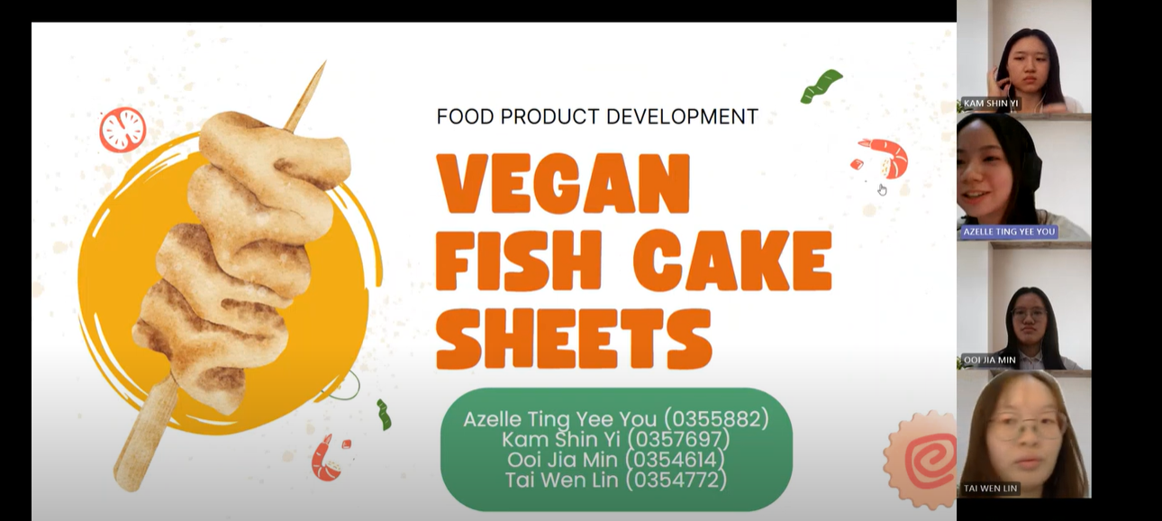
Fig. 1.3 Final product
Fig. 1.1 Group
During week 4, the Food science student provided us with a presentation for their food products.
Fig. 1.2 Food science students present
Fig. 1.3 Final product
Fig. 1.4 Product details
Moodboard
Fig. 1.5 Product details 2
We start out this product with creating a name for the product. Me
and Amelia not involved in the process of choosing the name. At first the
represent for the group from food science contact me and ask me what we
have to provide us with the product and end up we group a whatapp group
and they have a name for it is called " Shroomful".

Fig 2.1 chat with food science students
Based on the details I got from the food science group, I started
looking for some references for packaging, brand colors, fonts that
would fit the brand. Consequently, after comparing their safety and ease
of use to those of rivals' packaging, I chose to employ Crystalline
Polyethylene Terephthalate Pallets (CEPT) pallets for my goods. Our
freezer-friendly items may be stored in freezers and microwaves due to
their ability to resist temperatures ranging from -40°C to 220°C (40°F
to 428°F).Before design the label of the product, I find out the size of
the CEPT packaging to suits the label nicely.

Fig 2.2 moodboard

Fig 2.3 color palaette


Fig 2.5 packaging use

Fig 2.6 packaging size
Sketches
Following my improved understanding of the creative direction, I
began to plan out the information pages that needed to be included in
the labels and to draw up a basic design for the package. The first
design is based on fig. 3.1's packing layout. As a result, I decided
to include an odeng-style window on the box because, according to my
study, competitors' designs often lack windows while having attractive
designsThe second design is using a nice illustration on the
packaging.


Fig 3.2 Sketch 1

Fig 3.3 Sketch 2
Digitalize
After gaining a better understanding of the creative direction, I began
experimenting with various typefaces and colour schemes to create a simple
yet eye-catching colour scheme. However, Mr. Shamsul advised that I think
about the colours I use as He also recommended that I select a font family
with many font styles, such as Bold, Regular, and Light - Acumin Variable
Concept, to ensure that my fonts seem consistent.

Fig 4.1 first version of label
In the following week, I made improvements to the typography and
colour schemes, which make the package seem more like fishcake sheets
and look better but the packaging still lacks sufficient appeal. In addition, the stick on the label and the lidding film's odeng
design are not very appealing and are not practical because of
things like the label's movement and the box's transportation.In this instance, I decided not to separate the oden and stick
designs and instead widened the label.

Fig 4.2 refine design

Fig 4.3 refine design 2
Progress
I kept experimenting with alternative arrangements for the information on
the packaging's back and kept improving it. When designing this
section, food science students are constantly refining their product recipes,
cooking techniques, nutritional values, and materials, thus we can only
rank them approximately while constructing this section.

Fig 4.4 information layout design

Fig 4.5 information layout design 2
After they refine the solution of the product, I also adding in the
step of cooking and the allergy contain.

Refine on odeng design and vegan logo. I revised the odeng design and included a minor pattern to show that
the meal is vegetarian because the previous packaging changed and made
the odeng picture design less appealing.

Fig 4.7 odeng illustration

Fig 4.8 odeng illustration and vegan logo

Fig 4.9 font page design
I have also go to the food science lab to try the product.

Fig 4.11 product pic

Fig 4.10 product for display

Final Digitalize

Fig 5.1 Final digital design


Fig 5.3 Final mockup side

Fig 5.4 Final mockup back

Fig 5.5 Planogram

Fig 5.6 Planogram near
Fig 5.6 presentation slides
✧✧Feedback✧✧
Week 08:
Apply color and typeface
Week 09:
-Continue to experiment with different color palettes, choose and think the color that suit the product.
- add more to make interesting illustration for odeng.
Week 10:
-Try to use same typeface family that have different font style.
-Create a logo for vegan.
-barcode need white space to prevent can not scan.
-leave blank space for expired date.
Week 11:
central the brand name and logo
✧✧Reflection✧✧
ExperienceI learned a lot from this assignment. It gave me insight into designing packaging with a clear purpose and objective. I put a lot of effort into first designing a design that embodied the brand, steering clear of an outdated aesthetic in favour of a contemporary, clean aesthetic. Since I had to continuously adjusting the design features until they suited the food brand.
Observation
For this task, observation is fundamental. At first, I discovered that a lot of details were missed as I didn't know what had to be covered by the packaging design's content component. But Mr. Shamsul was really helpful in giving me a lot of suggestions. My creative juices were flowing from this study, which inspired my packaging design. Therefore, observation still has a significant influence on how the final packaging design is created.
Findings
This task taught me a lot since, in contrast to industry standards, working with clients necessitates close collaboration and communication between excellent design and client expectations. I also learned more about Malaysian packaging.


