Packaging and Merchandising Design- Exercise
Week 1 - Week 4 (25/04/2024 - 16/05/2024)
Lee Jia Rou 0363293
Bachelor
of Design (Hons) in Creative Media
MER 60104/ Packaging and
Merchandising Design
Exercise / Packaging Design Analysis
✧✧Instructions✧✧
✧✧Lectures✧✧
The Evolution of Packaging- 5000 BCE: The first known packing was used to store and carry food and other items. It was constructed of natural materials including leaves, reeds, and bark.
- 2600 BCE: The papyrus plant yielded a substance resembling paper that the ancient Egyptians used for packing.
- 1500 BCE: To store and transport liquids like wine and olive oil, the ancient Greeks and Romans utilised clay pots, amphorae, and jars.
- 1850: The invention of the paperboard box in England laid the groundwork for contemporary cardboard packaging.
- 1890s: The translucent, moisture-resistant cellulose film known as "cellophane" was created and quickly gained popularity as a means of packaging food and other goods.
- 1900s: Food transportation and preservation were revolutionised with the introduction of the first metal cans.
- 1930s: Synthetic materials like polyethylene and polyvinyl chloride (PVC) were used to make the first plastic containers.
- 1950s: The first aerosol cans were released, completely changing how home and personal care goods were packaged.
- 1970s: The development of recyclable and biodegradable packaging materials was prompted by the emphasis on sustainability and environmental concerns.
- 2000s: As e-commerce and online shopping have grown in popularity, new packaging technologies have been developed. These include air cushions, bubble wrap, and other materials that protect things during shipment.
Packaging Design
Product positioning is a strategic process that explains your product or service's location in the market, how it fits there, and why it's superior to competing offerings. Packaging design is the process of bringing a product's value to life through a visual and tactile experience that appeals to the customer. It takes more than simply selecting the ideal form, colour, text, and material when designing a package. Together, these elements provide a cohesive and eye-catching packaging that draws attention from customers and stands out on the shelves. A great packaging design must also consider the package's usefulness, including its affordability, sustainability, and simplicity of use.
Physical Protection: The product must be packaged to prevent damage during handling, storage, and transportation.
Identification: Packaging is often used to help buyers identify items more quickly and easily. Effective packaging design includes the product name, brand, and other important details that help customers instantly recognise the goods on store shelves or online.
To Transport: To transfer the product from the producer to the customer in an easy and secure manner.
Differentiation: To make a product stand out on crowded shelves, effective packaging design should include eye-catching and memorable colour schemes, typography, and artwork.
Communication: Clear and succinct language that explains to consumers what the product is and how it may be used should be a part of every effective packaging design.
Marketing: To create a unified brand identity that appeals to consumers, effective package design should be in line with the business's entire marketing strategy and messaging.
Information on Packaging
Product name: The name of the product must be clearly displayed on the packaging so that customers can easily identify what they are purchasing.
Net quantity: The amount or weight of the product contained in the packaging must be indicated, usually in both metric and imperial units.
Ingredients: If the product contains any allergens or other ingredients that may cause harm to consumers, these must be listed on the packaging.
Nutritional information: For food products, nutritional information such as the calorie count, fat content, and sugar content must be included.
Country of origin: The country where the product was made must be stated on the packaging.
Manufacturer information: The name and contact information of the manufacturer or distributor of the product must be included.
Warning labels: Certain products may require warning labels to inform customers about potential hazards or risks associated with the product.
Understanding Board Tools & Techniques
Packaging design necessitates not only a new set of hand skills for the packaging designer, ranging from innovative engineering to mastery of mock-up creation, but also a new way of thinking about a problem and presenting information.
The tools that package designer should have:
- Metal ruler
- Scorring tool
- Cutting mat
- T-square
- Adhesive (spray mount, PVA glue, double sided)
- Scissors
The structure of packaging:
- The polyhedron known as the six-sided box is the most often used polyhedron in storage systems. It is simple to put together and transport, display, and stack.
- The pyramid: The pyramid is a more elaborate polyhedron. Depending on the arrangement, a pyramid might have three sides or more, and its base will change.
- The cone Cones and pyramids are similar in that a cone's base is spherical and has one triangular side that wraps around itself along the base, whereas a pyramid's base has three, four, or five sides. Cones are uncommon in package design and provide special technical problems.
- The cylinder: The cylinder loops back on itself and has just one vertical side. Typically, moldable materials like plastic or metal are used to create cylinder shapes rather than paperboard.
Common Type of Boxes
- Paperboard boxes or cartons that fold are known as folding cartons.
- For instance, a cereal box
- Rigid boxes (Unlike folding cartons, rigid boxes, also known as set-up boxes, are more robust and do not fold or collapse. They're not usually applied to luxury goods where perceived worth matters. They are also utilised when the goods within is heavy and requires additional support.
- Brown cardboard boxes with corrugation: Alternatively known as combination board, corrugated fibre board, or corrugated board. Usually consisting of three layers, the wavy or fluted layer is positioned between the two outer, flat ones. mostly used to transport retail-ready products for a corporation.
Exercise – Packaging Design Analysis
1) Hi Top Tea (box)
For this exercise, we need to select four products on the market with different packaging types (boxes, bottles, paper bags, etc.) that we think have poor packaging design. We also need to make sure the product is easy to purchase because we need to bring it into the classroom. To choose products with poor packaging design, we need to combine the knowledge we have learned and conduct analysis from four perspectives: overview, product analysis, market research, and competitor analysis.
Overview
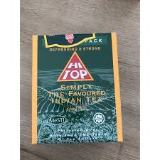
Highland India is where Enrico sources his Hi Top teas. Just tender leaves are chosen for these meticulously chosen teas. "Cutting," "turning," and "curling," among other "CTC" methods, are then used to prepare the tea leaves.
Highland India is where Enrico sources his Hi Top teas. Just tender leaves are chosen for these meticulously chosen teas. "Cutting," "turning," and "curling," among other "CTC" methods, are then used to prepare the tea leaves.
Product Analysis

This Hi Top tea packaging was the first poorly designed package I selected because I felt the front page's green pattern made it difficult for me to read the writing on it and made it difficult for me to tell what product it was when I first saw the packaging. Additionally, I believe the tea garden pattern on the green backdrop pattern should have been simplified by the designer, but it is hard to tell what pattern is on this package.Even though I was able to identify this was a bag of tea right away, I didn't instantly recognise what kind of tea it was until I came across an updated version of the package design that had a better backdrop image. In order to see additional information, I had to turn to the side of the box.
Market Research
The package's phrases tell us that there are two languages: Malay and English. Additionally, the packaging has the hala logo, which indicates that the target audience for this product is likely to be the Malay community or the Malaysian market. The patterns, colours, and other elements of this packaging design, however, are not focused on appealing to young people's aesthetics. Although I believe that the intended audience should be a little older, I find it difficult to read the content on the box because of the small, thick type. Not to mention those elderly people.
Competitor Analysis
Lipton

Lipton is the first tea brand that springs to me when I come across tea because of its beautiful packaging. When I buy tea , the colour of the container draws my attention and also reminds the bright colour of the tea leaves when brewed. The packing box features a white gradient effect in the centre to reflect sunlight, and a company logo on the front. Since this is a British company and most British people start their day with a cup of tea in the morning, I believe this is an excellent design.
2) soya drinks powder (plastic package)
Overview

Product Analysis
This Planet Bio Soy Milk plastic package is the one I went with. The fact that the soy milk powder is only placed in a foil bag and that the information is put on a sticker rather than being beautifully designed leads me to believe that this packaging is pretty straightforward. The label makes it clear that it is cholesterol-free, has no added sugar, and is made with a formula that substitutes for milk. You can see that this is a nutritious beverage produced with soy milk that is high in calcium.
Market Research
Competitor Analysis
The packaging design of Homesoy makes it evident to customers what kind of product it is. The product's weight and the fact that organic beans were used are prominently displayed on the front of the packaging. The packaging's colour is distinctly soy milk-related. The optimal brewing method nutritional data for the soy milk component, the manufacturing location, the barcode, and the best before date are all listed on the package's back.


3) perfume (glass bottle)


Overview
This perfume is from Che La Verne, a premium quality perfume form Paris at affordable price with 60+scents choice.Product Analysis
There is a glass bottle for this scent. Stickers with information are affixed to the glass bottles. The product's capacity, perfume series, and brand emblem are shown on the front of the packaging. The packaging has a product number on the rear side. The product comes mostly in black and white with gold accents. I believe there is too much information displayed on the sticker located on the cover. The sticker's content, which contains the brand name, product series, logo, and product capacity, prevents viewers from concentrating on the most important details when they view this package.
Market Research
The target group of the product is to allow consumers to buy different types of perfumes at reasonable prices.
Competitor Analysis


It's a glass perfume bottle as well. Only unique substance paper is used to print the brand emblem on the front of Celine's perfume. The bottom of the box displays all product information, guaranteeing its neatness and highlighting the product's upscale appearance.
4) toner (plastic bottle)


It's a glass perfume bottle as well. Only unique substance paper is used to print the brand emblem on the front of Celine's perfume. The bottom of the box displays all product information, guaranteeing its neatness and highlighting the product's upscale appearance.
4) toner (plastic bottle)


This is a face toner by RONAS Co., Ltd. is a popular Korean skincare brands that manufacture and supply a large selection of skincare products including vitamin c serum, toner etc.
Product Analysis
Due to the transparency of the toner, this package has an opaque off-white colour. To view the contents within, enough sunshine must be present. Product function and brand are listed on the front of the packaging; the product category name is missing. Verify if it is a toner and go over the information on the back before making a purchase. Nevertheless, only translation software may be used to decipher the Korean text on the reverse.
Market Research
When checking the information content, we can find that the language is all Korean, and we can judge that it is sold in mainland Korea. The product has a large capacity, so it can be judged that the people buying it are people who love to take care of their skin.
Competitor Analysis


