Creative Brand Strategy- Task 03
29.10.2024 - 11.12.2024 (Week 6 - Week 13)
Lee Jia Rou (0363293)
Creative
Brand Strategy / Bachelor of Design in Creative Media / Taylor's University
Task
03: Campaign Branding
Instruction
Lectures 01 - 04 are located in Creative Brand Strategy - Task 01.
Task 03: Campaign Branding
Before Start designing I found some references on Pinterest.

Redesign Logo
When I started the logo design process, I first compared my reference logo design to my original logo design. After analysis, I found that the logo design I wanted was simple and mostly based on lines and color blocks. So I went through some painting processes. During the process, I found that many of the bears I drew did not conform to the characteristics of bears, or they were very different from the original bear phenomena. So Miss Lilian suggested that I make some adjustments to the bear. After adjusting, I found that the elements of space can be displayed as circles. Before adding type design, I dug deep into Adobe Fonts to explore fonts that aligned with my vision. I specifically looked for typefaces that would balance a clean, minimalist aesthetic with a fun, approachable vibe, qualities that reflected the mood boards I created for the campaign.
Fig 1.1 Logo sketch

Fig 1.2 Logo sketch

Fig 1.3 Logo sketch

Fig 1.4 Logo refine progress

Fig 1.5 Logo refine progress

Fig 1.6 Logo revise

Fig 1.7 Logo black & white

Fig 1.8 Logo color
Graphical Elements
For my graphic elements, I aimed to create a fun, cute, and approachable
aesthetic that complemented the overall tone and energy of the campaign. These
elements will help my branding and can also become graphics for my branding
accessories.

Fig 2.1 Logo refine progress
For the packaging redesign, I first explored the target audience, brand image, and current market trends to better understand what the design needed to achieve. My goal was to create something clean and modern, but still fun and entertaining to appeal to a younger audience and families. The main changes are a change in color and a change in style.

Fig 3.1Packaging design layout

Fig 3.2 Packaging mockup

Fig 3.2 Packaging progress
At this stage of the project I started experimenting with design directions
using the resources I already had. My approach involves a trial-and-error
process of mixing and matching elements while ensuring the campaign’s color
palette remains consistent and cohesive to convey the brand’s ethos and
affinity, and planning out the messaging each post needs to convey before
designing.

Fig 4.1 social media progress

Fig 4.2 social media planning
For my promotional videos, my goal was to create content that felt natural,
inviting, and easy to watch. I hope to ensure that the content allows the
audience to feel relaxed and more connected with nature, expressing that in a
busy life, they can still get a healthy diet and a moment of silence to create
healthy and interesting snacks. To achieve this, I kept the editing simple and
clean, focusing on an effortless flow that was consistent with the tone of the
event. I've also integrated a variety of free stock videos, which help bring
this concept to life in a visually appealing and approachable way.


Fig 5.1 Promotional video Progress
Website
To start developing the website, I first looked on Pinterest for the style I
wanted. Then study the original brand's webpage to obtain content information.
Afterwards, I wireframed in Figma to develop the basic structure and layout.
This step allowed me to map out the visual hierarchy and flow of the website,
ensuring a user-friendly and intuitive design, filling it with relevant
images, graphic elements and text to bring the concept to life.

Fig 6.1 Website Figma Progress

Fig 6.2 Website Progress


Fig 6.4 Website phone mockup

Fig 6.4 Website laptop mockup
Merchandise

Fig 6.1 Website Figma Progress

Fig 6.2 Website Progress

Fig 6.3 Website Progress

Fig 6.4 Website phone mockup

Fig 6.4 Website laptop mockup
Campaign Posters
Poster design is similar to social media design. The storage locations are bus stops and subway stations so that busy people can follow this poster.


Poster design is similar to social media design. The storage locations are bus stops and subway stations so that busy people can follow this poster.

Fig 7.1 poster mockup

Fig 7.2 poster mockup
-Stickers


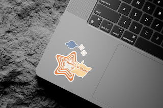
Fig 8.2 sticker artwork

The bags were designed to be approachable for the event, with the consumer in mind. I created two styles using the campaign’s minimalist design elements and the brand’s logo to ensure they were both functional and visually appealing. The bags not only promote the campaign but also align with its modern, health-conscious brand messaging.


Fig 8.1 sticker Progress

Fig 8.2 sticker artwork

Fig 8.3 sticker mockup

Fig 8.4 sticker mockup
-Tote BagsThe bags were designed to be approachable for the event, with the consumer in mind. I created two styles using the campaign’s minimalist design elements and the brand’s logo to ensure they were both functional and visually appealing. The bags not only promote the campaign but also align with its modern, health-conscious brand messaging.

Fig 9.1 Tote Bags mockup

Fig 9.2Tote Bags mockup
Final Presentation Deck
Reflection
Experience
The task was challenging and eye-opening. I am completely confused and overwhelmed by the idea of renaming a nostalgic snack like Honey stars, especially since this brand in Malaysia was the snack brand that everyone had in the same year. I’ve spent a lot of time reflecting on how I choose to reinvent this topic. It didn't help that I didn't have a clear reference point to guide me, and creative block hit me hard. I had to learn how to manage time and make designs that were both promotional and creatively interesting. I had to persevere to complete this work. This taught me that even when everything feels chaotic, I can actually get things done.
Observation
Throughout the process, I realized how important observation and analysis are in the design process. Because brand renewal is something that every old brand must go through, if there is no good insight during this process, the brand may face decline. Brand image creation can have a great impact on the brand, so as a designer, you must have the ability to express yourself in design. Initially, when designing, I was very confused about how to revamp the brand identity because I couldn't find a design that was very similar to what I envisioned for the campaign. However, by observing and analyzing existing branding and packaging designs, I gained some valuable insights.
Findings
Looking back, this assignment challenged me in ways I never expected, but it also gave me room to grow. I had my moments of doubt, but done. I've found that persistence, feedback, and attention to detail can make all the difference. It was a lesson in balancing creativity with practicality, and I became more confident in my skills and gained a deeper understanding of the design process. It’s safe to say that this experience has taken me further than I ever thought possible


