BRAND CORPORATE IDENTITY-TASK 4
26/06/2024 - 21/07/2024 (Week 10 - Week 13)
Lee Jia Rou (0363293)
MKT
62404/Brand Corporate Identity/Bachelor of Design (Hons) in Creative Media
Task
4 / Brand Guideline
✧✧Lectures ✧✧
Lectures 01 - 05 can be found here.✧✧Instructions✧✧
Task 4 / Brand Guideline
As this task coincides with Publishing Design: Task 03(B), there will be factors that will be mentioned in that post.
Finding Inspiration
Before I started constructing, I looked through Pinterest to acquire ideas for layout and design. I used what I knew about the basic brand requirements to pinpoint qualities that, in my opinion, made the Bunny Haven brand unique.


I studied his layout design by selecting a layout that I found to be straightforward and well-organised.


Finding the right layout
I started out by jumping straight in and making grids and margins to get my job started. These are the four that I had created initially.
We were provided a set of dimensions for this challenge, which were 1366 by 768.I made the decision to add some columns and a grid structure to the layout to make it look more ordered.
Fig. 1.1 Grid system created


Fig. 1.2 Page setup


Fig. 1.3-1.4 Margin & Columns settings
To find the ideal layout for me, I experimented with a variety of results.
Fig.1.5 Grid system created
Refined
In week 13, I made adjustments to the navigation system banner in order to better balance the layout from top left to bottom and also the Navigation Next & previous Button from left to right and left.
Fig. 2.1 Layout Refined-week 12
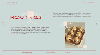
Fig. 2.3 Layout Tryouts week 11-12
Finding Images
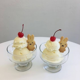
I get some inspiration for dessert-themed brand guidelines from Pinterest in order to improve the overall appearance.


Week 11:
Final Thumbnails
FINAL SUBMISSION


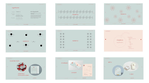

Fig 4.1 Final Thumbnails, JPEG
Fig. 4.2 Final Bunny Haven Brand Guideline, PDF Interactive
Fig. 4.3 Final Bunny Haven Brand Guideline, Online publishing
✧✧Feedback ✧✧
Week 11
Make sure that your text is place on the grid system and aligned properly throughout the page, add more image in the layout design.
Week 12
-Make the logo bigger instead of the title, make sure the text and box have enough space.
-Make attention to the balance of the layout when adding navigation banner.
Week 13
- write more detail of the brand guideline, but the overall design layout is better now.
✧✧Reflection✧✧
Experience
When I think back on my thrilling experiences, I learnt a great deal from it. At first, it was difficult for me to find a balance between keeping the design consistent and avoiding a boring appearance. I had a lot to learn because of this. I was unsure about where to begin, even though I knew roughly what my brand rules needed to be in order for them to match my logo and had some basic ideas about how to do it. But the helpful criticism from Mr. Hijaz and Ms. Lilian was priceless. Their wisdom helped me get past my first uncertainties and led me.
Observations
A key tactic I used to ensure I established brand standards I was comfortable with was observation. Not that I'm inspired, but I think my branding standards are utterly ridiculous. I firmly think that by studying and learning from the successful designs of other designers, I have improved my own work.
Findings
I was able to learn how to enforce brand guidelines—especially mine—by doing this. Identifying Bunny Haven's aesthetic and learning more about how to make sure I didn't go lost gave me a step forward in my learning process to become a more consistent designer.
✧✧Further
Reading ✧✧
https://admindagency.com/blog/how-to-ensure-brand-compliance-with-brand-guidelines/ 


