BRAND CORPORATE IDENTITY-TASK 3
Week 6 - Week 10 (29/05/2024 - 26/06/2024)
Lee Jia Rou 0363293
Bachelor of Design (Hons) in Creative Media
MKT 62404 / BRAND CORPORATE IDENTITY
Task 3/Positioning & Identity
✧✧Instructions✧✧
✧✧Lectures✧✧
Lectures 01 - 03 can be found here.Lectures 04 & 05 can be found here.
Task 3 Brand Identity
Brand Positioning framework
I searched Pinterest for a variety of references throughout the week in order to get ideas for my brand application. In order to have a better knowledge of how previous designers have accomplished excellent design, I concentrated more on current café and nature-related designs for my advertising materials and settings.
Fig 1 framework Positioning & Identity
Logo Applications
- Business Card

Fig. 1.2 Name Card Progress
After receiving feedback from Ms. Lillian, I tried adjusting the two I chose to
fit the design and finally made the mockup.

Fig. 1.2 Name Card mockup
- Letterhead and Continuation
For my letterhead and continuation, I think they reflect the least part of
our design because they are more formal. When designing, I tried to use the
pattern designed by the previous task to add it to make it less serious. I
also designed two types of letterheads with different colors to see which
type of layout is suitable.

Fig. 1.3 Letterhead and Continuation
- Invoice

Fig.1.4 Invoice Progress

Fig. 1.2 Invoice Progress 2
- Envelope

Fig. 1.3 Envelope Progress
Collaterals- Menu

Fig. 1.4 menu Progress
- Sticker
For my stickers I used the brand Cherry, a previously designed pattern that
makes up this set of stickers.

Fig. 1.5 sticker Progress

Fig. 1.6 sticker Progress 2
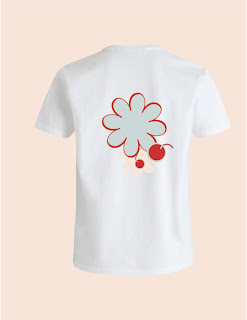
- T-shirt

Fig. 1.7 T-shirt Progress
- Takeaway bag

Fig. 1.8 Bag Progress
Digital Presence

- Website
I am seeking for some inspiration in figma as I am accustomed to layout
since I am developing a web page.

Fig. 1.10 website design

Fig. 1.10 website design
Artwork


Mockup


Fig. 2.1 name card (front)

Fig. 2.2 name card (back)

Fig. 2.3 Letter Head

Fig. 2.4 Letter Head (with mockup writing)

Fig 2.5 Letter Head (continuation)

Fig 2.6 Envelope

Fig 2.7 Sticker

Fig 2.8 T-shirt (front)

Fig 2.9 T-shirt (back)

Fig 2.10 Menu

Fig 2.11 Takeaway bag


✧✧Feedback✧✧
Week 7
Redefine vision and mission
Week 8
Independent Learning Week
Week 9
Requires completion of environmental graphics, website and social media
presence
✧✧Reflection✧✧
Experience
I had a great time with this challenge. I love making business cards and other marketing collateral to be highly intriguing, even if I occasionally get confused while developing things, especially invoices. This task offered me a lot, though it was difficult and time-sensitive. I particularly learnt to think of my brand rather than just myself. All in all, this was one of the most pleasurable tasks I have ever completed.
Observations
I was able to grasp many approaches and ways of thinking by browsing Pinterest and other people's work. I learned how to maintain the brand's general consistency by seeing how they used certain aspects to highlight their brand. This is a subdued yet efficient method of instruction that points me in the correct path.
Findings
I believe that a company's overall look plays a big role in defining its image. During my initial session, Ms. Lilian's remarks encouraged me to concentrate on the style of my brand. This project emphasises how crucial it is to keep your brand image constant.
I believe that a company's overall look plays a big role in defining its image. During my initial session, Ms. Lilian's remarks encouraged me to concentrate on the style of my brand. This project emphasises how crucial it is to keep your brand image constant.


