Publishing Design_Task 2

Lee Jia Rou 0363293
GCD 61404 / Publishing Design / Bachelor of Design (Hons) in Creative Media
Task 2 / Content Generation
✧✧Lectures✧✧
Lecture 02/ History of Print
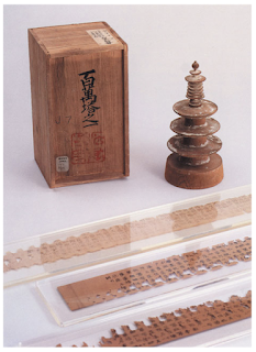
2nd - 8th Century AD
In 175 AD, the Chinese Emperor gives the order to have the six
great Confucian classics carved into stone. Eager to obtain the key
texts, the Confucian scholars had to place paper on the carved slabs
and rub it with charcoal or graphite.


Korea & Japan: AD 750-768
One amazing accomplishment of East Asian Buddhism is the
creation of printing. A sutra produced in Korea around AD 750 on
a single sheet of paper is the oldest known printed
scripture.

The empress of Buddhist Nara commissioned a big fortunate
charm or prayer in AD 768. A million copies of the project
were printed and given to pilgrims; it is said to have taken
six years to finish.
The woodblock print known as Hyakumantō Darani is well-known.
Japan is home to the oldest of these records.
The first printed book: AD 868
The scroll is one foot high and sixteen feet long. It was
created by joining the edges of paper. The scroll's first
sheet had the earliest printed picture, which showed an
enthroned Buddha flanked by Holy Attendants.

Movable type: from 11th century
Before printing became an effective means of disseminating
information, movable type—separated ready-made characters
or letters that may be placed in the right sequence for a
certain text and then reused—was a required measure. The
idea was tested as early as the eleventh century in China.
The Chinese script's excessive character count made
typecasting and typesetting extremely difficult. Another
is that Chinese printers make their characters overly
delicate for the intended use by casting them in clay and
firing them like pottery.
Koreans established a foundry in the latter part of the 14th century to manufacture metal type that could be moved. Bronze is a robust material that can be repeatedly printed on, disassembled, and reset for fresh writing. Since the Koreans were still using Chinese writing at the time, they had the issue of having a large character set. This was resolved in 1443 when they created ashan'gul, or their own alphabet.
Saints & Playing Cards(AD c.1400)
The printing method using wood blocks was brought to Europe in 1400. Similar to how they were printed in the East, the pictures were created by simply placing a sheet of paper on a block that had been carved and inked, then wiping the ink off of it. The primary market is sacred icons for pilgrims to purchase, same like in the east. Another early item from the western trade is playing cards.
Gutenberg & Western Printing( AD 1439 - 1457)
The first recorded mention of Gutenberg in relation to
printing dates back to a Strasbourg court case in 1439.
Nothing from this era has remained, but Gutenberg is
credited for printing tiny passages of text from moveable
type, which is what Strasburg does. The second time
Gutenberg is mentioned in connection with printing, it was
in 1450 in Maine when he borrowed 800 guilders from Johann
Fust, securing the loan with his printing apparatus.
One of the printing presses that Gutenberg invented was
able to provide a quick and constant downward pressure.
Gutenberg's proficiency with metalworking allowed him to
gain mastery over the intricate processes involved in
producing individual letters of type. These processes
include making a master copy of each letter, designing
moulds that allow for the casting of many versions, and
preparing an appropriate alloy (type metal) to cast the
letters in. The fundamental process of printing—aligning
and spacing the individual letters in a way that would
keep them steady and level while transferring ink
uniformly to the paper—comes before this deft use of
technology.

The Bible printed by Gutenberg did not include dates. In
the middle of the 1450s, it was produced concurrently on
six presses. It is known that at least one copy was
finished on August 24, 1456, with the starting letters
manually painted crimson.

Lecture 03/ Typography Redux
Typography
Typography is like breathing to a graphic designer. The
most crucial aspect of graphic design to become proficient
in if we want to hold ourselves to high standards. It is
the craft of structuring and writing text. In addition, it
is a means of expression and—above all—of communication.
It has a major part in design work.
Our comprehension and awareness gained over the last two
semesters will be vital to book design.
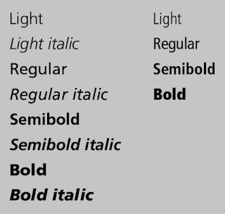
Characters in a typeface
- Small caps
- Numerals
- Fractions
- Ligatures
- Punctuations
- Mathematical signs
- Symbols
- Non-aligning figures
Legibility
It is crucial to follow recognised legibility rules in
order to guarantee that a body text is legible. A
designer must be fully aware of these guidelines in
order to deviate from them. It is necessary to select
fonts that are open and well proportioned in order to
make text readable.
There were a lot of new capabilities available for
typesetting using computers. But this also had
drawbacks, such as typographic norms being broken at the
reader's cost by those who were unaware of them. A few
things need to be kept in mind to make sure the type is
readable.

- Underline
- As underlining impacts reading, it should be decreased to avoid touching the characters, yet many programs do it wrongly. Two styles of underlining are available: one emphasises the words individually, while the other highlights the entire text.

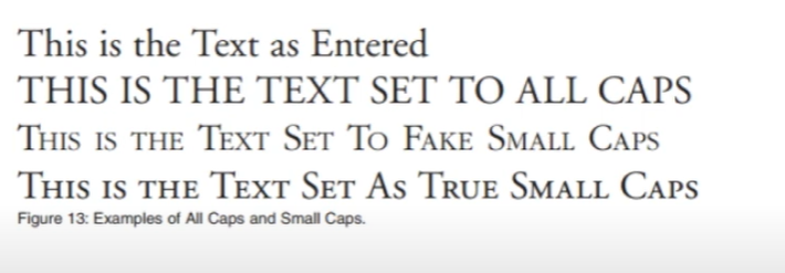
- Small Caps & All Caps
- For subheads and the opening line of a paragraph, small caps work well. Short headlines or subheadings should employ text that is all caps. Please take notice that using all caps in lengthy sentences or for emphasis is not permitted. The purpose of capital letters was not to be used freely, but rather to be punctuated.
- Special-Purpose Style
-
Software for creating footnotes, references, and mathematical calculations
comes with a variety of formatting styles. A typical user might not be
aware of them because they are typically contained or buried inside the
tools sections.

- Text Scaling
-
Certain applications enable the generation of pseudo-condensed or
pseudo-extended fonts by stretching or squeezing the type in either a
horizontal or vertical direction. This warps the font's original design
and gives it a cheesy appearance.

- Outline & Shadow
- An additional style that is frequently misused. To properly and efficiently format text, one must have years of experience. It shouldn't go over one point for the outline. Take care that shadows don't detract much from the primary text.

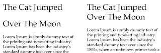
When font sizes, line lengths, and spacing between lines of type have a
harmonic connection, the result is text that reads smoothly. Impairment to
legibility is impartial and can even impact well-designed types. A type
column should have a maximum of 65 characters, with most columns having
roughly 50. If not, the words would be difficult to read due to their
excessive cramming.
The amount of space between type lines is referred to as
leading/line spacing. There are no hard and fast guidelines for line spacing, just like there
are for font size. But there are a few things to think about:
- The font used: Some require more line spacing than others to keep their ascenders and descenders from touching.
- The line length: Longer lines require more leading for easier reading
- The type size: The larger the type size, the more line spacing is require. This rule mostly refers to body copy; headlines which are normally larger set, may actually be set with tighter line spacing.
In addition to tiring the reader, excessively lengthy or short lines of type
ruin a good reading rhythm.
Extra care is required, depending on the application being used to format
the text. To prevent widows and orphans, larger type sizes necessitate
adjusting the spacing between letters and paragraphs.
Kerning
Inter-character spacing, sometimes known as kerning, gives the text a
nicer appearance. The majority of page layout products apply kerning
automatically, while the majority of word processors do not provide kerning
modifications. But certain letter combinations would require human
corrections.

Tracking
Though it pertains to the adjusting of a specific set of letters, words,
and spaces, it is comparable to kerning. The primary goal is to fit the
type within the designated area without changing the font's size or line
spacing. It might be either favourable or bad. Fixing individual words or
the conclusion of a paragraph is a crucial usage.
Word spacing can determine the correct word spacing which
includes the typeface chosen. Consistent spacing makes an even typographic
"colour".

Italics
must be used cautiously. Reading is hampered by large sections of
slanted writing. It works better when used to emphasise points inside text
than when it stands alone as text.
letters take up more room and make reading more difficult. It isn't
visually interesting.
Alignment
- Flush left, ragged right: Produces very even letter and word spacing. Since the line terminates at different points, it is easier to locate the new lines. It is the most legible of aligning text.
- Flush right, ragged left: Works against the reader. Suitable for small amounts of text, but not recommended for large amounts.
- Centred alignments: Give a very formal appearance and is good when used minimally. However, setting large amounts of text this way should be avoided
- Justified text: Can be very readable if its design ensured spacing between the words are consistent and that awkward rivers do not interrupt the flow of the text.
Paragraph Indent
In cases when the text is justified, indentation should be utilised. It may be
excessive to use both paragraph spacing and indentation. The indent should be
10 points if the type size is 10 points.
Special Formatting
Although they can also be used to separate text from one line to the next, hyphens are mostly employed to divide words or numerals. Never hyphenate a headline or subhead at the end of a line.


Modular
Special Formatting
Although they can also be used to separate text from one line to the next, hyphens are mostly employed to divide words or numerals. Never hyphenate a headline or subhead at the end of a line.
Lines must frequently be broken to make text readable. When the goal is to
break the line, just entering a return can change the formatting. Most
applications offer line breaks (Shift+Return) to sidestep the issue.
Reports with new chapters or special parts should begin with drop
caps. There shouldn't be more than three lines. Avoid using programs
without auto settings if they don't exist.
Lecture 04/The Grid
Raster System
The usage of grids as ordering systems is the expression of a certain
mental attitude which showcases how a designer produces their work in
terms which are constructive.
The grid divides a two-dimensional plane into smaller fields or a
three-dimensional space into smaller compartments. The compartments
maybe the same or different in sizes.
The Purpose of the Grid
The grid that designers employ can resolve issues with vision. A
designer can strategically position text, images, and diagrams in a
logical and useful way by organising surface and spaces into a
grid.
This produces a feeling of clarity, comprehensibility, and compact
planning. In terms of design practice, it also implies
orderliness.
Modular
Although modular in nature, the grid should not be used as a
restriction. It does permit flexibility—that is, provided the designer
can see a wide range of possible configurations.
To preserve some continuity or coherence in its view and navigation, a
boundary must be established. Since each book's contents might have a
distinct range, a lot of this depends on what's in it. A grid makes it
possible to organise the data such that it is simple to read and
comprehend.
Lecture 05/ Elements
All publication consist of 3 major elements:
- Type
- Colour
- Image
While incorporating variance into the layout, a designer should keep
the book's overall style consistent. This means introducing diversity
in the arrangement and mix of parts, but leaving some sections
permanent, such as the hang line, typography, colour, and picture
styles.
✧✧ Task 2 / Content Generation✧✧
Moodboard

In terms of color, a large number of green and blue tones are used to show the original village and the bright feeling of the future.
Final Submission

Fig. 1.1 Visual 01- Cover picture

Fig. 1.2 Visual 02- the long stilt house 

Fig. 1.3 Visual 03- Bamboo chair

Fig. 1.4 Visual 04- World War 2 army in kampung

Fig. 1.5 Visual 05- World War 2 news

Fig. 1.6 Visual 06- World War 2 Japan airplane

Fig. 1.7 Visual 07- Banana Tree

Fig. 1.8 Visual 08- grocery shop(job 1)

Fig. 1.09 Visual 09- furniture (job 2)

Fig. 1.10 Visual 10- Naco window to nails factory (job 3)

Fig. 1.11 Visual 11- nails factory to car (job 4)

Fig. 1.12 Visual 12- car business (job 5)

Fig. 1.13 Visual 13-met my grandma

Fig. 1.14Visual 14-car business and wood business

Fig. 1.15 Visual 15-bus driver(job 6)

Fig. 1.16 Visual 16-grandpa and grandpa portrait
Figure 1.17 Visual Compilation, PDF
back to top
Experience
At the beginning, I had intended to display the photos as pictures. But since I didn't know enough, I felt that using photographs straight from the Internet would be problematic and I didn't want to do that. Subsequently, I experimented with sketching on the iPad and found that I could utilise it to manually create images. Finding stock photographs and combining them with my collection of photos is made simple and saves me a tonne of time. Even though the photographs still need a lot of work, I still consider it to be a significant development.
✧✧Feedback ✧✧
Great illustrations, love your drawing style.
✧✧Reflection✧✧
Experience
It was a fun experience all around, if a little stressful. The enjoyable aspect lies in the fact that hand-drawn images have a fascinating effect. It was frustrating, though, since I had to produce a lot of visual effects in a short amount of time. Initially, I intended to display it as a series of images, but as time went on, I didn't take enough, so the series was very brief. Painting and creating using only existing photographs and photos I find online in a short amount of time is a challenge for me. The time constraint made me change my approach and challenge myself to think more creatively even though I was feeling overwhelmed.
Observations
Through this experience, I was able to see which illustrators' techniques fit my story style (a Malaysian rural vibe) and could be learnt quickly. This allowed me to spend time studying the works of my favourite artists, which has been a very effective way for me to get better at what I do.
Findings
At the beginning, I had intended to display the photos as pictures. But since I didn't know enough, I felt that using photographs straight from the Internet would be problematic and I didn't want to do that. Subsequently, I experimented with sketching on the iPad and found that I could utilise it to manually create images. Finding stock photographs and combining them with my collection of photos is made simple and saves me a tonne of time. Even though the photographs still need a lot of work, I still consider it to be a significant development.