ADVANCE TYPOGRAPHY - Task 2
20/09/2023 - 07/11/2023
Week 3 - Week 11
Lee Jia Rou /
0363293
Advanced Typography / Bachelor of Design (Hons) in Creative
Media
Task 2 (A) Key Artwork
Task 2 (B) Collateral
✧✧Contents✧✧
~Lecture5: AdTypo_5_PerceptionAndOrganisation~
~Task 2 (A) / Key Artwork~
~Task 2 (B) / Collateral~
~Feedback~
~Reflections~
~Further Reading~
✧✧Lectures ✧✧
AdTypo_5_Perception & Organisation
Perception
Addresses the reader's visual navigation and interpretation through
contrast, form, and organization of content in Typography.

Fig 1.2 Contract / Size


Fig 1.4 Contrast in Structure

Fig 1.5 Contrast in Direction

Fig 1.6 Contrast in Colour
Contrast/Size
a technique that directs the reader's attention to a specific point.

Fig 1.7 Gestalt theory for organization
Gestalt: Perceptual Organisation/Groupings
Law of Similarity
Law of Proximity
Law of Closure
Law of continuation
Law of Symmetry
✧✧Instructions ✧✧
Task 2 (A) Key Artwork
In this task we need to explore and compose our name or pseudonym with minimum of 4-5 characters to created a wordmark. The final key artwork must be an elegant solution, well balanced and composed, not complicated or confusing that leads to a functional and communicable key artwork. This key artwork will subsequently be used in Task 2(B) collateral.
1.Reference
Before design a wordmark, I research on
Pinterest of what a wordmark look like and also look on the style that I
like to start on for my design. On the research I found out that are
different between wordmark and monogram. Wordmark visualizes the full
brand name but a monogram is a logo composed entirely of letters rather
than words. This is a small mistake that I done when found a reference but
it not to affect the style I decided to do.

Fig 2.1 wordmark References

2.Sketches
Before starting to design a wordmark, I try out drawing some sketches with different combination. I created several ideas before deciding on the wordmark design, arranging and refining my work in various combinations to get the ideal outcome.
Before starting to design a wordmark, I try out drawing some sketches with different combination. I created several ideas before deciding on the wordmark design, arranging and refining my work in various combinations to get the ideal outcome.

Fig 2.3 Sketches (Week 4: 19/09/2023)

3.Progress
At first, my wordmark looked bold and unobtrusive. Mr. Vinod gave me some
advice on how to make my design better. He advised me that in order to
communicate well a message through text design, it must be easily
understood and simple. Readability must be given the most importance while
creating information. I take care to focus on the font design itself
rather than letting excessive typing damage the font arrangement. The
balance between readability and personalising is important to my wordmark
design. Create the ideal balance between making sure that message is
received clearly. So after the first version wordmark, I refine it and
sketch the (fig 2.4) wordmark with refer to the simple font that I found
which is the font call 'Henri Didot' (fig2.2) and digitalize it in Adobe
illustrator.(fig 2.6)The next week, I get feedback that the thin stroke is
to thin and can't be see from far away, so some of the stroke I make it
thicker and some of it I just remove it.

Fig 2.5 Digitalize 1 (Week 4: 20/09/2023)

Fig 2.6 Digitalize 22 (Week 4: 22/09/2023)

Fig 2.7 Final (Week 5: 28/09/2023)
Fig 2.8 Final-pdf (Week 5: 28/09/2023)
Task 2 (B) / Collateral
In this task, we have to design a t-shirt, lapel pin, an animated key
artwork and an Instagram account (or as instructed in class) transforming
the key artwork into a brand. Students will work on the animated key
artwork first and fine-tune the outcomes before going on to the and other
collateral material: t-shirt, lapel pin and finally an Instagram account.
The output must result from in-depth exploration and must communicate both
visually and textually the desired message and mood set by the key artwork
and its function.
1.Progress
1.Progress
At first, I put my wordmark in the central of the canva to see
how to extent the design in to shape or word and I play out with some
circular and the word 'A' with different combination.


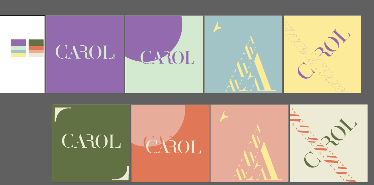


Fig3.9 Instagram- desktop screen (Week8: 18/10/2023)


 Fig3.14 Final collateral 1 (Week8: 18/10/2023)
 Fig3.15 Final wordmark 2 (Week8: 18/10/2023)
 Fig3.16 Final collateral 2 (Week8: 18/10/2023)


Experience :
As I've always been interested by the wordmark design, I had
no idea where to begin. I first couldn't really figure out how
to really represent myself through design, as I found as I
looked further into my work. When I began creating, I wasn't
even sure what I wanted. After that, you will continuously
understand the elements and design ideas of word marks with
the lecturer's help.
Observation:
Findings:
I’ve learned the difference between a wordmark, monogram, and logo design. In this assignment, discovery is important to make a simple yet creative wordmark design even better.
The Vignelli Canon

Fig 3.1 expand wordmark - out line (Week 6: 03/10/2023)
Fig 3.2 expand wordmark (Week 6: 03/10/2023)
Applying colours :
After finishing the design, I started picking out some color palettes
and put it in the collateral.
Fig 3.3 different color palette (Week 6: 03/10/2023)
Fig 3.4 work in progress (Week 6: 03/10/2023)

Fig 3.5 collateral- business card(Week 7: 09/10/2023)

Fig 3.6 collateral-small cloth bag (Week 7: 09/10/2023)

Fig 3.7 collateral-t-shirt (Week 7: 09/10/2023)

Fig 3.8 Print out-t-shirt (Week 8: 20/10/2023)
Instagram:
Instagram Link @carol_jrl

Fig3.8 Instagram- phone screen (Week8: 18/10/2023)

Fig3.9 Instagram- desktop screen (Week8: 18/10/2023)
Animation:
Fig3.10 wordmark gif work in progress (Week8:
18/10/2023)
Fig3.11 wordmark gif (Week8: 18/10/2023)

Fig3.12 wordmark gif (Week8: 18/10/2023)
Final Submission:
Fig3.13 Final wordmark 1 (Week8: 18/10/2023)


Fig3.17 Final self portrait (Week8: 18/10/2023)

Fig3.18 Final collateral 3 (Week8: 18/10/2023)
 Fig3.19 Final wordmark 3 (Week8: 18/10/2023)
 Fig3.20 Final self portrait (Week8: 18/10/2023)


Fig3.21 Final wordmark 4 (Week8: 18/10/2023)
Fig3.22 Final- pdf (Week8: 18/10/2023)
✧✧Feedback ✧✧
Week 4
General Feedback: The wordmark need to be easy to read
and remarkable.
Specific Feedback :Don't do it to complex, come out
with something clear, simple and readable.
Week 5
General Feedback: The thin lines stroke need to be
bold to easily distinguish each letter from a distance.
Week 6
General Feedback: Do not scale wordmarks to
avoid inconsistent strokes. Palettes must have different
color themes to avoid similarities. Expand the identity in
different position and compose.
Week 7
General Feedback: Avoid unnecessary duplication. Try
out more collaterals.
✧✧Reflections ✧✧
Observation:
This assignment provides a valuable opportunity for
self-discovery and expression of our creative ideas. The use of
color to express emotions gives the entire work a different
texture and identity.
Findings:
I’ve learned the difference between a wordmark, monogram, and logo design. In this assignment, discovery is important to make a simple yet creative wordmark design even better.
✧✧Further Reading✧✧


In a Corporate Identity Program enough diversity must be
provided to avoid sameness and to increase attention. Too
much diversity creates fragmentation - a very common disease
of badly designed communication. Visual intensity should not
be confused with mere visual impact, as it represents
intellectual elegance and is essential to effective design.
Therefore, achieving visual power deserves serious attention
during the design process.


